Attention Marketers! Security and Data Privacy are a Bigger Part of Your Job Than you Might Know

security features google SSO data privacy Imagine you run a successful digital agency, and suddenly get an urgent email from the IT department.

Turns out, an account manager who left the company months ago has continued to log into your software, moved tons of high-value clients to a sub-account, and has shut you out completely—effectively stealing your hard-earned rolodex of clients as his own.

Or, you work in a marketing team and IT has discovered an unauthorized person has logged into your SaaS tools and now has access to all of your data, payment details, and even your customers’ data, too.

Considering many businesses now run almost entirely on the internet (and the average marketer uses anywhere from 12-31 different tools), the above scenarios aren’t just unsettling—they’re not as far fetched as we’d hope. Sure they may not happen everyday, but as a marketer you need to ensure they don’t happen to you.

Whether it’s protecting your data or that of your customers, today we’re taking a closer look at security, data privacy (including the upcoming GDPR), and sharing what we’ve rolled out at Unbounce to make sure our platform doesn’t leave you scrambling.

Making your life easier, and more secure

Us marketers tend to love inviting as many users into our SaaS tools as needed (faster workflows for the win!), but user management, and other potential threats involving passwords and more can be a nightmare waiting to happen in the eyes of IT. Overall, we all need to be especially careful choosing software tools that IT can stand behind.

At Unbounce, we know you may not have the time or resources to ensure you have the latest security measures in place. And you want to be able to focus on building incredible marketing, anyway (not fretting about security).

So we’ve spent the last few months making sure we’re the most secure conversion platform out there.

We’ve rolled out a few new features to ensure you can breathe easy and focus on conversions. And we think your IT team will love them.

Introducing single sign-on

IT administrators often need centralized platforms. Being centralized helps keep track of all of the users of a given account, especially as you scale. And now you can do this with Unbounce via Google Single Sign-on (SSO).

Available on all plans, this means you can use your Google account and credentials to log into Unbounce.

In short, you can now easily manage verified users of your Unbounce account from one, central directory. Your IT manager will be over the moon 🙂

More built-in safeguards

Connected to single sign-on, as marketers we rarely need to consider the importance of authentication or how it works, but it roughly boils down to password requirements, access, and how IT can confirm it’s actually you logging into an app and not someone else.

Back in a less secure time, a typical password requirement workflow depended on two factors:

  • Something you are – i.e. your identity , confirmed via email address, and
  • Something you know – i.e. your password, or a security question if you’ve forgotten.

But many of the things you know, someone else might know too. Moreover, 80% of people reuse passwords across several sites. A password shared with just one site that’s been breached can be used to gain access to another site (something you need to ensure can’t happen).

Fortunately there’s a way to effectively ban this by adding a third factor to the equation with two-factor authentication (2FA). The idea behind 2FA is that accessing especially secure software now requires one extra thing:

  • Something you have – i.e. an authentication code you have access to via an app on your phone, for example.

Intended to make it difficult for attackers to exploit vulnerabilities (like password reuse and phishing), 2FA is the option to authenticate users’ identity with their mobile device in addition to their username and password.

Available on our Enterprise plans and above, you can now add an extra layer of protection to the login flow with an authenticator app.

Google Authenticator is very popular (accessed via your phone), but you can use any of the following in line with your company’s IT policies:

We’re now one of the only conversion marketing platforms with two-factor authentication built right in (so you don’t have to go through integrations or workarounds to comply with your IT manager’s wishes!)

Wait, who did that? (Audit logs, your new lifesaver)

Beyond accessibility to software, it’s important your organization gets complete visibility and control of user actions in the tools you use.

As one of our agency clients once joked about with us, they’d invited a client into Unbounce to preview their pages, but this particular client was always trying to get edit-access to their landing pages to make sneaky changes to suit their preferences on the fly. This was, of course, not malicious but the account owners were later scratching their heads as to why pages were magically changing, and why so many integrations were suddenly broken.

The lesson here is that, beyond being able to assign user capabilities, you need to have a high-level breakdown of what’s going on in your SaaS tools, including who does what, and when.

This is why we’ve recently introduced audit logs on enterprise plans or higher to provide admins with a detailed trail of account activity. Used in tandem with our version control feature, you can now both identify changes made to your Unbounce creations and roll back any undesired changes to previously saved pages.

Overall, an audit trail can be used to detect suspicious activity or to playback account activity during an incident review and it can be very helpful for you to have for harmless rollbacks, or larger security-related infringements.

More detail? Click to enlarge 🔎
Want to learn more about Unbounce’s industry-leading security features? Get the details on what’s available on each plan here

Data privacy and the GDPR

Up ‘til now, we’ve largely covered security in this post, but we’d be remiss to not mention data privacy too. The two tend to get grouped together, but there is a difference.

While security largely tends to involve your brand’s protection, data privacy relates more holistically to the protection of the collection and dissemination of data (often related to your customers or lead’s data in a marketing context).

This is especially relevant for you because, when running virtually any marketing campaign, you collect information from individuals and then process that information.

In the case of running landing pages, popups, or sticky bars in Unbounce, we each play a role. You as the controller, and Unbouncer as a processor:

  • Unbounce’s Customers as Controllers
    You make decisions on what data you’d like to solicit and how that data is used. As the creator of a form, you’re not only deciding on what data to collect but how you plan to use that data with your marketing stack.
  • Our Role as a Processor
    Unbounce will process data on behalf of our Customers. When you use an Unbounce Form, Unbounce is doing the “behind the scenes work” to store and transfer that data.

Why is this important?
Privacy concerns exist wherever personally identifiable information or other sensitive information is collected, stored, used, and finally destroyed or deleted – in digital form or otherwise. Improper or non-existent disclosure control can be the root cause for privacy issues, and it’s up to you to ensure both your data collection and the software you use to collect data is compliant.

Data privacy is especially timely now concerning GDPR.

What is GDPR?

The General Data Protection Regulation (GDPR) is a new data privacy law which will come into effect on May 25, 2018, impacting how businesses collect and process data from individuals who live in the European Union (EU). It’s the most significant piece of data protection legislation to be introduced in the EU in 20 years, and will replace the 1995 Data Protection Directive.

GDPR is currently a hot topic, and understandably as it will have a major impact on Unbounce and our customers. So we’re doing everything we can to keep you all up to speed on our efforts on becoming fully compliant.

We have a landing page that outlines all you need to know.

Hey, I’m not in the EU, does GDPR affect me?
Yes — if you have customers in the EU, plan to have customers in the EU, or process any form of EU data, this applies to you.

Unbounce takes data privacy very seriously, and we view the GDPR as an opportunity to further enhance our commitment to data protection for the benefit our customers.

Right now we’re completing a comprehensive audit of the GDPR’s requirements and identifying where we need to make modifications to our platform, contracts, and documentation.

Our top priority is ensuring that our customers have confidence in our product, and that data you collect and process in our platform for your marketing campaigns meets the GDPR, complying by the date of enforcement.

Rest easy

On a whole, security or data privacy threats involving SaaS tools are like insurance. You hope you never have to worry about them, but you need to be prepared all the same.

We’re excited to be able to provide industry-leading security for you, and we’ll always work to alleviate issues of security and data privacy, so you can focus on campaigns.

Why your re-targeting is not as effective as could be?

According to a latest report by Merkle Inc. advertisers spend 33% of their advertising budget on Retargeting efforts.  That is a huge chunk of the budget!

 
According to another study, the average Click Through Rate for Display ads is 0.07%, while those for Retargeting is ten times that number i.e. 0.7%, . However, that is still dismal.  Why?  Because of the way most organizations retarget, and obviously, their approach is wrong. 

There are three major types of retargeting processes which companies perform;

  1. Retarget everybody who visited your site.  
  2. Retarget those who did not convert.
  3. Retarget only those who left items in shopping cart.

However, all these approaches still result in very low CTRs and conversions. Of course, they are better than general display ads but still dismal – unless you consider 0.7% as great CTR!
So, what is the problem?

Let’s take the three retargeting scenarios above one by one.

  1. Retarget all your visitors – You are just using spray and pray here.  There is no strategy, no intelligence used.  I have seen this in past, where agencies, on behalf of their clients, use this technique to show how good their targeting is. They do mass display advertising, which produces dismal results and then retarget those who came to the site. Of course you are now going to get better CTR because you are targeting those who have already shown interest.  But the result is still incredibly low.
  2. Retarget those who did not convert – Better than targeting everybody but not much.  You are still targeting those who had no intention to convert. No matter how many times you chase them they just are not interested; you are not selling what they want, and they may have just landed on your site accidentally.  To make matter worse, companies will continue to retarget them to death, and thus tarnishing their brand value. 
  3. Retarget only those who left items in the shopping cart – much better than the first two cases. Now, you are only targeting those who have taken at least some action to show that they were interested, even if they did not convert. However, there are still two problems with this approach;
    1. You don’t know the reason why someone did not convert – most companies will just show the products left in the cart in their retargeting ads.
    2. You are leaving out all those visitors who were willing to convert but did not start the checkout process.
What’s the Solution?

A few years ago, when I started with Retargeting, the approaches I mentioned above were “correct” as they were the only reasonably practical ones to implement.  But now, with new technology available, we don’t need to continue to waste ad impressions and dollars.  Machine Learning can tell us the factors that drive conversion, so we can Retarget in an intelligent manner, using relevant messages sent to visitors who are most likely to convert, and we can avoid chasing (and annoying!) those who have no intention of converting.

Now here comes the sales pitch:

I am working with one such company, DXI. Our technology allows you to do just what I described above. If you are interested, let me know and we will be happy to run a no-obligation pilot for you. Best of all, you don’t need to do make technology or process changes.  Just give us access to your Google Analytics data and we will do the rest.  Visit DXI at http://www.dxilogy.com

——————————————————————————————————-

Join Global Analytics Academy for Online Courses in Digital, Marketing and Analytics

What the Google Chrome Ad Blocker Means for Your Website Popups (Plus 8 Really Smart Targeting Tips)

blockquote h2 {margin-left:0px !important;}
blockquote p {font-size: 1rem !important;}
blockquote p em {font-size: 1rem !important;}
blockquote.long p {font-size: 0.9rem !important;}
blockquote.long p a {font-size: 0.9rem !imporptant; text-decoration:underline !important;}
hr {margin:70px auto 80px auto !important;border-top:1px solid #ddecf2 !important;}
.exampleTitle {padding:20px 5% 20px 9% !important;margin-top:50px !important;}
strong a {font-weight:bold !important;}

Last week you likely saw a ton of news about Google Chrome’s Ad Blocker going into effect Feb 15, 2018. And nobody could blame you if you took one look at some of the reports and thought, “Oh no! Popups are dead. Google just outlawed them, and I have to take down the 35 I’m using across my web properties that are generating 12,000 leads per month”.

Well, fortunately, after combing through the details, I’m happy to tell you that — from our early interpretation — this doesn’t seem to be true.

You can still confidently use popups and sticky bars on your website and landing pages, and today I’ll take you through the news with a bit more nuance to explain why (and how to do so without compromising your user experience).

As I wrote in Technology isn’t the Problem, We Are. An Essay on Popups there’s a reason why bad marketing practices exist (spoiler alert, it’s bad marketers), and we all need to play a part in reversing these bad practices because frankly, we all deserve a better internet.

Here at Unbounce, we welcome this defense of higher internet standards by Google. But we do need to unpack the announcement to see what the potential impact could be on your marketing activities.

What is the Google Chrome Ad Blocker and Why Are We Talking About It?

On February 15th 2018, Google officially introduced an ad blocker to the Google Chrome browser that will screen for (and eventually block) what they deem to be “intrusive” ad experiences. This is further to Google’s partnership with the Coalition for Better Ads they announced previously with the January 10th 2017 change re: Mobile ad experiences.

In short, while it seemed like news last week, it’s an initiative that’s been in the works for some time.

The Coalition for Better Ad Standards

The Coalition for Better Ad Standards (CBA) is a group made up of trade associations and companies involved in online media. Their mission is to improve consumers’ experiences with online advertising and includes a set of global standards that address consumer expectations with online advertising.

As part of this mission, they performed a research study of 25,000 consumers to identify the ad experiences most likely to make those consumers install ad blocking software.

The study presents a range of user experience factors to discover which ones ranked worst. But before we get into the ads raising concerns, we should first address what constitutes an ad.

What is an Ad (In the Eyes of The Better Ad Standards Coalition)?

This is where things start to get a little vague. As per the Better Ads Standards website:

An “ad” is promotional content displayed on the web as the result of a commercial transaction with a third party.

In our interpretation, the above refers to a paid ad (such as Google AdSense) that appears on your website, not a popup containing your own marketing materials such as an e-commerce discount, a newsletter subscription, or a time-sensitive offer. The third party being an ad network and the ad being what’s delivered to the website.

If this is the correct interpretation it makes sense, because ads such as this are not related to the marketing efforts of the host website. They’re the result of the host website trying to generate ad revenue and presenting incongruent and somewhat random display ads.

However, at this time, it’s admittedly difficult to determine exactly what the coalition is considering an ad. To ensure we get you the best answer possible, we contacted Better Ad Standards directly to clarify whether our early interpretation of their definition is correct.

My main question is concerned with how the two parties will be evaluating the ads. Is it the content or is it the delivery mechanism? In other words, are Chrome and the Better Ad Standards coalition concerned with the interaction method of the message delivery? Or the content of the message? Or a combination of both?

My gut says it’s a combination, where the content must be considered an “ad” and the delivery mechanism falls into a few specific categories of interaction that are deemed as bad experiences.

Update from the Coalition for Better Ads

We got a response back from the CBA pretty quickly which was awesome. Unfortunately, the response didn’t really add any extra clarity to the original definition.

Here’s a portion of my question:

Are you able to confirm whether an ad in this instance includes website popups (or sticky bars) for our own business, placed on our own website? For example a newsletter subscription popup on our blog, or a discount popup on our pricing page.

Or are you referring to paid ads from an ad service such as Google AdSense that appear on a website, but are not part of that website’s business? For example, an ad for hair products that shows up on the New York Times.

And a portion of their response:

You should direct any questions about the Chrome browser and its plans to Google.

The Coalition does not currently provide specific evaluative guidance on questions of interpretation relating to the current Better Ads Standards. However, in conjunction with the Better Ads Experience Program, this service may be offered to participating companies in the future.

The Coalition for Better Ads plans to release additional details about its Better Ads Experience Program in the coming months. The Program will certify web publishers that agree not to use the most disruptive ads identified in the Better Ads Standards and will accredit browsers and other advertising technology companies that will assess publishers’ compliance with the Standards and filter digital ads based on the Standards. If compliance issues arise, certified companies will be notified and have an opportunity to address violations or to pursue review by an independent dispute resolution mechanism available through the Program.

The opening of enrollment for publishers that wish to certify their compliance with the Better Ads Standards and participate in the Program’s register was recently announced. Interested publishers can follow this link to learn more about the Program and the registration process. The Program expects to introduce an independent dispute resolution mechanism in the second quarter of this year.

Further updates on the Better Ads Experience Program are forthcoming, so please continue to monitor the Coalition for Better Ads’ blog and press releases page for updates. All Coalition initiatives and authoritative guidance are first published on the CBA website.

Based on this, I’m still not entirely sure if our interpretation is right or wrong.

If we are wrong, then it’s more important than ever to be creating the best possible experiences, and the easiest way for you to do that is with advanced targeting and triggers. You will find 8 examples of proactive great experience creation at the end of the post.

Here are some smart ways to do the right thing if you want to skip ahead to some implementation ideas:

  1. Campaign Scheduling
  2. Cookie Targeting
  3. Referrer URL Targeting
  4. Location Targeting
  5. Click Triggers
  6. Mobile Scroll Up Trigger
  7. Frequency
  8. Super Advanced Multi-Option Targeting

Which types of ad experience are raising a concern?

On desktop they refer to the following four ad experiences:

And mobile has an even larger set:

Again, while the images above could be alarming to anyone running popups, based on our early interpretation of the definition above I don’t think these are popups or sticky bars that you place on your own website with your own marketing content in them. I think we’ll end up finding as time goes on that the standards are targeting at neutralizing bad behavior with respect to third-party ads.

Does this mean you should ignore these guidelines if you’re not using third-party ads?

Not entirely, no. Conscientious targeting and triggering still reign supreme. You can continue to present popups and sticky bars to visitors on your website, but you should use the guidelines to do everything you can to deliver great experiences.

To help avoid getting warnings now that the standards are in place, Google offers a tool which can help you to determine if they consider your website to be infringing on the guidelines or not.

How to Check Your Website For Adherence Using The Google Ad Experience Report

The Ad Experience Report is designed to identify ad experiences that violate the Better Ads Standards, and you can check it for both desktop and mobile inside Webmaster Tools (now simply called Web Tools).

You can find the Google Ad Experience Report here.

When you choose your web property from the drop-down on that page, you will see this:

The video explains how it all works, and if you click desktop or mobile in the left navigation, you’ll instantly get a report like this one for unbounce.com:

If you receive any warnings you can make changes and request a fresh site review.

From Google:
Violations of the Standards are reported to sites via the Ad Experience Report, and site owners can submit their site for re-review once the violations have been fixed. Starting on February 15, in line with the Coalition’s guidelines, Chrome will remove all ads from sites that have a “failing” status in the Ad Experience Report for more than 30 days. All of this information can be found in the Ad Experience Report Help Center, and our product forums are available to help address any questions or feedback.

What Else Can You Do to Create Better Popup Experiences?

I fully embrace this news and the mission of the Coalition for Better Ads because it gives me the opportunity to broach the topic of popup misuse. As a platform offering popups, sticky bars (and landing pages of course) it’s incumbent upon Unbounce to take a stance and work hard to help marketers deliver especially respectful and responsible web experiences.

Popup misuse typically falls into the following categories:

  1. Interaction modes that prevent control of the experience by the visitor (such as easy and obvious close and bypass mechanisms).
  2. Manipulative copywriting that uses psychological means to coerce visitors into taking an action, such as the manipulative confirm shaming styles like this: [ Get Your Ebook ] [ No ebook for me. I prefer to kill kittens! ]
  3. Overly persistent frequency rules where you show the popup every time someone arrives.
  4. Multiple popups on the same page, at the same time.

To provide a method of evaluating popup experiences and to help combat bad behavior I created The Popup Delight Equation.

Essentially the equation reverse engineers an excellent popup experience and allows you to generate a percentage score by analyzing seven principles: clarity, control, creativity, relevance, charm, value, and respect.

I’d also recommend you read Stop Making These Common Mistakes with Your Website Popups (Includes Examples and Quick Fixes) which has some great ideas on the topic.

What is Unbounce Doing to Help Customers Avoid Ad Blocker Warnings?

Fabulous question! I asked Cole Derochie, one of Unbounce’s product owners, to elaborate on how we’re approaching the news and what it means for our customers.

“Unbounce respects this policy, and shares Google’s concern for ensuring users are able to easily access content — regardless of device.

Our goal with popups and sticky bars is to help our customers make offers that are relevant and valuable, and thereby increase their conversion rates, without harming the user experience.”

As I mentioned earlier, it does seem the news pertains to third-party ads, but having said that, we are determined to help marketers adhere to great internet standards. One way we’re doing that is by creating tips and warnings inside the Unbounce builder to help prevent some of the design methods that Google considers bothersome, in particular for the mobile experience.

For instance, in the screenshot below, a warning appears if you try to increase the height of the sticky bar beyond 100px:

Despite our belief that this announcement (and the general concerns of Google and the Coalition for Better Ads) isn’t specifically directed at regular popups and sticky bars, it does still represent an opportunity to take an honest look at the ways we’re all presenting our marketing, and step away from some of the more blatant behaviors mentioned in the research.

One of the best ways to ensure a quality experience is to use some of the more advanced targeting, trigger, and frequency settings that Unbounce provides to give your visitors a respectful interaction that’s as relevant as possible.


Using Targeting, Triggers, and Frequency to Improve Popup and Sticky Bar Experiences

From a high-level philosophical perspective, we should be thinking beyond surface level conversion metrics to focus on quality rather than quantity. I’m referring to tactics like showing popups on every visit, which in my mind is just a little desperate, and destined to not be delightful.

Here are some ways you can deliver a better user experience and stay on Google’s good side:

Method #1 – Campaign Scheduling

If you’re running a time-sensitive campaign, it’s important to only show your offer when it’s actually valid. I’m sure you’ve seen those “live” chat windows that tell you nobody is home. If nobody is home, don’t show the live chat box dummies! Similarly, you don’t want to show a discount or special offer when it’s already expired.

In Unbounce you can set your campaign schedule down to the minute.


Method #2 – Cookie Targeting

Cookies are a great way to create more personalized experiences, basing the display of you offer on previous visitation or behavior tracking. But they are equally as powerful when you use them as an exclusion mechanism.

Let’s say you have an offer for a discount on your SaaS product to encourage people abandoning your website, but you don’t want existing customers to see it (it could make them jealous or upset that they didn’t get the discount).

If you are able to set a cookie within your app somewhere to label a customer as a customer, you can then use the “Don’t Show” cookie targeting to make sure they are not shown the offer.

Bazinga!


Method #3 – Referrer URL Targeting

Context is king when it comes to communicating your message quickly, and if you target your popups and sticky bars using the referrer URL option you can present content that’s highly relevant to where the visitor just came from. This is especially effective for co-marketing where your popup or sticky bar can showcase both brands by including the partner’s logo, creating a more powerful connection between the two experiences.

Here’s another really interesting use case that uses the “Don’t Show” setting.

I’m in the middle of a reboot of our landing page course, and I’m running some popups containing Typeform surveys for the purposes of research.

The problem though is that the homepage of the course is a landing page on a subdomain of the primary course domain – and I’m running the survey on both the homepage and the internal pages of the microsite.

Course homepage URL: do.thelandingpagecourse.com
Internal course page URLs: thelandingpagecourse.com/*

There’s a lot of organic traffic coming to the homepage and also the internal pages. But I don’t want to show it to a visitor to the homepage, and then show it again when they click through to start part one of the course.

To solve this problem, I set a “Don’t Show” setting on the Referrer targeting like this:

Which means that none of the internal course pages will show the popup if the visitor got there via the course homepage. This is a brilliantly simple way of solving what would otherwise require a bit of complex coding to resolve.

Even better is the fact that you can add as many “Show” and “Don’t Show” targeting rules as you like.


Method #4 – Location Targeting

Unbounce location targeting allows you to drill all the way down to the city level, and all the way up the the continent level. Personally, I’d be stoked if someone from the Antarctic saw one of my popups, but there are times when you do need to hide your marketing from certain locations, or target it specifically to a location or locations.

Just like in #3, the great thing is that you can add as many rules in here as you like, so you could set it up like the image below to target every major city in Texas, avoiding rural areas if that so happens to not be your target audience. Or reverse it to target all rural areas and avoid the cities. YUSS!


Method #5 – Click Trigger

Undoubtedly the best trigger type is the click trigger. Why? Because it’s entirely user-driven. A great use case for this option is two-step opt-in forms where your popup with a form only shows up when requested. The conversion rates are typically very high because the initial click declares intent making the contents of the popup desirable.

With Unbounce you can set the click trigger to work on any page element by using the CSS id, or you can even apply it to a CSS class which could make multiple page elements interactive.


Method #6 – Mobile Scroll Up Trigger

Google has expressed discontent for certain types of popup that appear on entry, on mobile devices. For this reason we created the “Scroll Up” trigger. It works a little like an “Exit Trigger” on desktop as it may signal that someone is leaving the page. If you use this, and keep the size of your Sticky Bar to 100px in height or below, you can create a nice experience that’s not too interruptive, doesn’t prevent the visitor from leaving, and lets you notify them of something important.


Method #7 – Frequency Settings

What’s the frequency, Kenneth? If you don’t get that reference then either you’re really young or I’m really old. Either way, frequency matters. And when you get it wrong it hertz. << Please tell me you got that one.

Pro tip – once and done
When in doubt, the first option (“Show once per visitor”) is the best. Show it once, and go cry in your soup if it didn’t convert. Do NOT pester people over and over again. If they want it they’ll say yes. If they don’t, well that’s a lesson (in the form of a poor conversion rate) you can use to better understand your audience.

For the other options, if you wanna be super respectful and let people check out your site without any distractions, think about using the “Show only on visit x” option. Typically the x would be the number 2. Show it the second time they are there. That way they’ve had the chance to get to know you and your offer will seem more relevant.

For example, there’s nothing more annoying on a blog than when you get an entrance popup saying “Love this content! Subscribe for more!!!!!”. No, I don’t love this content cos I just got here, dammit! Whereas if you show it on the second visit, you know they liked you enough to come back. Done.


Method #8 – Super Advanced Multi-Option Targeting

How about this idea for some extreme relevance! You can use all four advanced targeting rules at the same time to get hyper-personalized. In the example below I’m targeting people in Vancouver, Canada who’ve got a cookie called “ILikeTurtles” who are coming from my partner’s site during the dates of my campaign. SICK!

In Conclusion: What Should You Do Now?

Well for starters I recommend that you go make 50 popups with “Every visit” targeting and a frequency of 100 times per visit.

Wait. Don’t do that.

Do what a thoughtful marketer would do and spend some time thinking about your visitors, and about the really cool things you can do when you combine triggers, frequency, scheduling, and advanced targeting rules.

The combinations are literally limitless. I’m not sure on my math there, so there may be some finite limit to what you can do, but whatever it is, it’s huge!

This is a hot and contentious topic, with much to discuss, particularly because of how hard it is to interpret some of the communications surrounding it, so please add comments with any intel or different perspectives you have.

We’re committed to staying on top of the situation as it continues to unfold, and will bring you more details and ideas as soon as they become apparent.

Here’s to better marketing standards, and better marketing in general.

Cheers
Oli Gardner

$(function() { $(‘a[href*=#]:not([href=#])’).click(function() { if (location.pathname.replace(/^\//,”) == this.pathname.replace(/^\//,”) || location.hostname == this.hostname) {var target = $(this.hash); target = target.length ? target : $(‘[name=’ + this.hash.slice(1) +’]’); if (target.length){$(‘html,body’).animate({scrollTop: target.offset().top}, 1000);return false;}}});});

Stop Making These Common Mistakes with Your Website Popups (Includes Examples and Quick Fixes)

Depending on who you talk to, website popups are either a godsend for list building and subsequent revenue creation, or they’re a nuclear bomb for the user experience.

Some can’t stand popups and completely disregard sites that use them (or that’s what they say, at least). And there are even entire websites dedicated to hating on especially bad popups.

However, many marketers are fully charmed to their capabilities for revenue generation, lead collection, and driving attention and conversions in general.

It doesn’t have to be an either/or situation, though.

You can create website popups that aren’t detrimental to the user experience; In fact, if you do it really well, you can even improve the user experience with the right offer and presentation.

We all want to be companies that care a lot about our visitors and make the best popups possible, so it goes without saying, we care about timing, targeting, and triggering (i.e. who we send offers to, when we send them, and what those offers are). After all, the main reasons visitors get annoyed by popups are 1) when they disrupt the user experience and 2) when they offer no value or help:

Fortunately, you can easily solve for these things. In this article I’ll outline common website popup mistakes with real examples, and I’ll cover a few ways to remedy these mistakes.

Mistake 1: Poor timing

One of the biggest mistakes marketers make with website popups is with timing. It’s almost always the case that we trigger popups too soon (i.e. right away, no matter the context of the page or visitor).

On an Inbound.org discussion, Dustin J. Verburg had this to say:

“The most hilarious popups are the ones that say ‘LOVE THIS CONTENT? SUBSCRIBE FOR MORE’ because they assault my eyes before I even read two words of the article.

Now I guess I’ll never know if I love the content, because I close the tab immediately and never come back.”

Similar to Dustin, imagine you’re taking break from work to check out GrowthHackers. You find an article on the front page that looks interesting. You open it and immediately get this:

Woah, what’s this full screen takeover? I know this is common today, but most people are jarred by this experience.

Now you may not even remember what the article was, so you’re likely to click away and go back to actual work.

One possible way to remedy this – just spitballing here – could be to add some copy explaining that the visitor needs to click to continue on to the article. Forbes does this (though Forbes could never claim a good user experience without a good laugh):

At least you know where you’re at (the logo is prominent) and what to do (continue to site). But, it goes without saying, Forbes’ experience is not ideal so don’t copy it.

So how do you fix poor timing?

The best possible solution for user experience is to trigger a popup at a time that actually benefits a visitor. On a long-form blog article, this is usually at some point of strong user engagement, either measured by time on site or, better, by scroll-depth and content engagement.

You can do this with an on-scroll popup created in Unbounce.

Once you’re happy with your design, simply set your trigger for when someone scrolls through a certain percentage of the page, or even after a delay you specify:

Click above for a larger, clearer image.

Overall, poor timing is a common problem, and it’s almost never intentional. We simply act hastily when setting up popups, or we spend all of our time crafting the offer and forget that when the offer is shown matters too.

I want to point out, however, that it’s not always a bad decision to throw a popup at visitors on arrival. It’s all about context.

For example, if you’re shopping for clothes, there are a million options available. Therefore, it’s imperative for ecommerce shops to grab your attention as quickly as possible with an attractive offer. This is why you see so many website popups with discounts on arrival on ecommerce sites, like this one from Candle Delirium:

As well as this one from BustedTees:

It’s a very common tactic. We’ll go over it specifically in regard to ecommerce later in section three.

In general, it’s important to analyze a visitor’s behavior and trigger the popup at the exact moment (or as close to it as possible) that someone would want to subscribe/download your offer/etc. It’s a lot of work to tease out when this may be, but the analysis is worth it as you’ll annoy fewer visitors and convert more subscribers or leads.

Fix annoying timing: Consider the user experience. Does it warrant an on-arrival popup? If not, what’s the absolute ideal timing for a popup, based on user intent, behavior, and offer?

Mistake 2: Poor targeting

Poor targeting is a broad problem that’s usually made up of a mismatch between who you’re targeting and what offer you’re sending (though, you could also add in when you’re targeting them as a variable as well).

For instance, if you’re targeting a first time organic visitor to a blog post with a popup that announces a new product feature, you may spur some confusion. Rather, you should try to target based on appropriate user attributes, as well as within the context of where they are in the user journey. A better offer for a first time blog visitor might be an ebook or email course on a topic related to the blog post.

An example of poor targeting is LawnStarter’s guide on their post about where new residents of Birmingham are moving from. It’s a cool infographic-based guide they’re offering up, but the popup is really irrelevant to the content of the post someone’s currently reading in this case:

In another, better example, Mailshake has a massive guide on cold emailing, which would be a daunting read in a single session. It’s probably appropriate, then, that they offer the book up for download via a sticky bar at the bottom of a related article:

There are ways they could improve copy, design, or the offer itself, but the core point is that their targeting is spot on (i.e. after someone’s reading something about cold emailing, and offered up as added, downloadable value).

Now, if I already visited this page and downloaded the playbook, and they still hit me with this offer, then we’d have a targeting problem. They could use the fact that I’m a repeat visitor, as well as a subscriber already, to target me with a warmer offer, such as a deeper email course, a webinar, or possibly even a consultation/demo depending on their sales cycle and buyer’s journey.

The fix for poor targeting

Remember with targeting, you’re simply trying to align your offer with your visitor and where they are in their awareness and interest of your company and product.

This is where the value of progressive profiling comes in. But if you’re not doing that, at the very least you should be aligning the offers on your page with the intent of the traffic on that page.

You can also target offers based on URLs, location, referral source, and cookies. Really think about who is receiving your offer and at what point in the customer journey before you set a popup live.

With popups created in Unbounce, for example, you can use referral source as a way to target appropriate offers to someone who’s come from social traffic, vs. someone who’s arrived via AdWords traffic:

Simply create your popup, and in advanced targeting, select which referral sources you’d like to have access to the offer:

Fix targeting the wrong people at the wrong time with the wrong offer Analyze your customer journey and intent levels on content. Craft offers according to customer journey status as well as on-site user behavior.

Mistake 3: Offers with no obvious value

How many times have you been on a blog that simply wants you to sign up for a mailing list, no value promised or given? Like this:

If you’re an active reader of the blog, maybe this works. After all, you already know the value of the content and simply want to sign up for updates. Makes sense. But I’d wager this type of active reader is a small percentage of traffic, and these people will sign up however they can. Thereby the popup isn’t useful for everyone else.

As we covered before, a much better way to capture attention is with a discount, like Allen Edmonds offers here as soon as I land on the site (on another note, this is a great use of an immediate triggering. It’s not an annoying popup when it delivers me a discount).

This is a super common ecommerce tactic.

It’s a competitive world out there, and giving an immediate hit in the form of a discount is a good way to capture some of that oh so valuable attention. It’s especially common when used on first time visitors to the homepage, as a homepage visitor’s experience is generally more variable and less intent-based (if they land on a product page from a search ad, it’s a bit of a different story).

Here’s an example from Levi’s:

The fact that most ecommerce sites have similar messages nowadays is indicative of a creativity problem, one that presents itself to marketers in any industry. We look to competitors and to the consensus and think that we can’t fall behind, so we replicate tactics.

However, I’m more interested in sites, like Four Sigmatic, that push beyond and implement a creative offer, like their lottery style subscription featured below. (This is one of the only popups I’ve signed up for in months, by the way):

Offering up poor or no value is really the least forgivable mistake if you’re a marketer. Crafting offers that align to your buyer persona is your job. Also, it’s fun. If you have a bland offer, this could easily be the biggest opportunity for lifting conversions, as well as improving the user experience (no one is complaining about awesome offers).

Foot Cardigan does a really good job of offering value and conveying it in a fun way too:

Triggering popups with zero value? Think about ways you can give massive value to your site visitors, so much that they really want to give you their email, and create an offer for this.

Mistake 4: Poor design

If you use Unbounce Popups, it’s almost hard to create an ugly one. Still though, the internet is filled with eye-sore examples:

Design matters. A poorly designed website element can throw off your whole brand perception, which is important in creating trust, value, and in easing friction.

As Ott Niggulis put it in a ConversionXL article:

“Success in business online is all down to trust. You either see something that makes you trust a vendor or you don’t. Trust is also directly linked to conversions – if people leave your website because it’s so badly designed that it makes you seem untrustworthy then you’re missing out on lost prospects, customers, sales, and profits.

Good design = trust = more conversions = more money in your pocket. It’s as easy as that.”

That same article cites a study where 15 participants were directed to Google health information that was relevant to them, then they were asked about their first impressions of the sites.

Out of all the factors mentioned for distrusting a website, 94% were design related. Crazy!

So don’t just put up a poorly designed popup thinking the message will be the focus. Put some effort into it.

Of course, you don’t always need to look like a luxury brand. If cheap spartan is your schtick, then it can work for you. After all, Paul Graham’s site isn’t pretty but it’s so, so valuable:

Image of Paul Graham’s site.

As Aurora Bedford from NN/g explains it, it’s more about matching design to your brand values and objectives:

“The most important thing to remember is that the initial perception of the site must actually match the business — not every website needs to strive to create a perception of luxury and sophistication, as what is valuable to one user may be at complete odds with another.”

No matter what your brand positioning may be, however, make sure you clean up obvious design mistakes before hitting publish.

Fix up bad design: Spend a few hours longer designing your popup, hire a designer, or use a tool like Unbounce with a template.

Mistake 5: Poor Copy

Presenting your offers with clear copy is huge. Most copywriting, not just on popups but online in general, is:

  • Boring
  • Vague
  • Confusing
  • Cringe-inducing

…in that order, I’d wager. Not often do you find crisp, clear, and compelling copy (unless it was whipped up by a professional, of course).

As with the example below, you’re more likely to find copy that’s vague (how many ebooks, which ones, etc.) and cringe-inducing (Rocking with a capital R is pretty goofy):

The copy you write for your popup may be the most effective mechanism you have for converting visitors (outside of the targeting rules). Here’s how Talia Wolf, founder of GetUplift, put it in an Inbound.org comment:

“Many people are trying to capture your customer’s attention too so you need to give them a good reason for subscribing/not leaving.

It’s not enough to talk about yourself, you need to address the customer’s needs: one way is by highlighting the value your customer gains. The other, highlighting what they might lose. (Example: “Join thousands of happy customers” vs. “Don’t lose this unique content we’re giving our subscribers only”

Her website has a solid example of a popup with great copywriting, by the way:

Sometimes, all you need to do is pull your message to the top and make it prominent. Often we try to write clever copy instead of clear copy, but clear always beats clever.

For example, if the following popup led with the money offered for the account, it’d probably be more compelling than their current vague headline:

Mistake 6: Overload

Sometimes websites can get pretty aggressive. Here’s an experience I ran into on Brooks Brothers’ website:

One (pretty value-less) popup that I click out of, only to be followed by another one:

Now, there’s just a lot of clutter going on here. Different colors, different offers, different banners. As a first time visitor, I’m not sure what’s going on. Plus, they have animated snowfall, which adds to the clutter.

This is quite extreme, but it’s not uncommon for marketers to see some results with a popup and go overboard, triggering two, three, even four in a single session. When all of this occurs within 10 seconds of being on the site, things get annoying quickly.

Take down too many popups: Simplify and strategically target any popups on your site. They shouldn’t appear everywhere for everyone, your targeting is key.

The lesson

Popups don’t need to be annoying. Rather, they can actually add to the user experience if you put a little time and effort into analysis and creative targeting and triggering.

If you avoid the mistakes here, not only will your popups be less likely to feel intrusive, but they’ll convert better and they’ll convert the types of subscribers and leads you actually want.

Run a popup experiment of your own See Unbounce templates you can get up and running today.

Get a Glimpse into the Future of PPC From Microsoft’s Senior Manager of Global Engagement

Purna Virji on AI and PPC
As I learned at the start of February, if you’re a lucky enough to get one-on-one time with Purna Virji, Senior Manager of Global Engagement at Microsoft, you ask her about the future of search, AI, and pay per click (because she makes everything sound pretty exciting).

Purna—named the #1 most influential PPC expert in the world by PPC Hero in 2016—is on the forefront of what’s coming down the pipeline in our industry. She’s joining us February 21st as a speaker for Marketing Optimization Week to share her insight into AI, and today we’re sharing a sneak peek of what to expect in that session.

Watch our chat below, or read on for the condensed Q&A.

Jen: What do you imagine the day-to-day life of a marketer will be like with access to exciting AI? You grab your morning coffee, log on to your computer, then what?

Purna: [Then] you’ll be getting all kinds of wonderful notifications about performance, new insights, and ideas for engaging with your audience. AI solves some of our biggest problems—including [how to] engage with people in this world full of distractions.

AI is super helpful because it can analyze all of the different data and touchpoints to see what’s working (or not), and it can help us get really good at personalization and engaging with people in the way they’d like to be engaged with.

It also gives us new interfaces. Things like chatbots or digital assistants, as well as virtual reality. So if I interest somebody through a chatbot to look at the latest collection of shoes, I can just put on my HoloLens and take a look at a 3D hologram in front of me of all the latest styles.

It’s really about cool ways to engage with brands and people in a very seamless manner.

Jen: You’re speaking at Unbounce’s Marketing Optimization Week February 21st on how to prepare for AI’s emerging role in marketing. As a preview, can you share one of those things we can all prep for?

Purna: Yes! I think one of the things marketers can prepare for is to understand what AI can do for us and try to touch the waters a bit more with a chatbot. [In my talk] I’ll be giving people some tips for how to incorporate a chatbot within search. For example, Bing offers a conversational bot right in the SERPs, so I’ll give some tips on how you can set this up and a strategy you can use for your bot.

Jen: Chatbots are very hot right now.

Purna: It’s because they’re so easy and convenient. You’re already using a platform you’re familiar with—whether it’s Skype or Facebook Messenger or Kik—or whatever platform you use to talk to your friends. In that same platform, I can order a pizza or check on a status of my order, or do anything I need to do with a brand in that same place. There’s no multiple hops that have to happen.

Jen: It seems like, for customers, chat is very natural. It’s how we already go about our world.

Purna: yes—conversation is the first thing we learn. From babies to now arguing about who’s going to take the trash out. Conversation is [still] at the forefront of all of our lives.

Jen: Here at Unbounce we’re a Conversion Platform for marketers, and many of our customers pair landing pages with PPC in social or search. How do you see AI impacting pay per click the most in the next few years?

Purna: I think AI will have a couple of different roles…

For one —it’s going to make it easier to hone into the right person. We’re already seeing some signs of this with our much more advanced audience targeting, such as in-market audiences—which lets you slice and dice audiences based on people who are more likely to buy —so it’s going to [enhance] reaching the right person at the right time.

It’s also going to help us take a lot of the effort and pain out of the administrative side. We saw this with bit automations…it’ll make things like reporting a lot easier, keyword research a lot easier. Anything that’s really a repetitive task can get automated and can be improved by AI. Time savings and more effective ads – it’s a win win for all.

Jen: Y’know, we hear some marketers kind of demonize AI, or see it in a sort of detrimental way. But you don’t see it this way.

Purna: No, I don’t think so. I think the way AI has been designed and actually, the way companies like Microsoft, Google or IBM, who are at the forefront of creating AI…I think the responsibility is on people like us to infuse the technology to respect humans. And, I mean, that’s one of the pillars we’re building our AI on, that it is respectful to the human. It’s there to augment what we can do. It’s not there to replace us or destroy us or anything like that.

All AI is doing is taking what we’re good at and giving us a little super power. It’s like wearing a little jet pack so we can run faster or slide faster. When you think of it that way it’s giving us gifts we didn’t have access to before.

Jen: You’re no stranger to setting up an AdWords or Bing campaign. So, what’s a little known technique that anyone managing paid spend can do today for more impact with their PPC ads?

Purna: I’d say there are two things. The first is to make sure you’re implementing in-market audiences. If someone was to ask me, “what’s one tip for success for 2018?”, I’m a big believer of the power of in-market audiences, it’s still in pilot in open beta so anyone can sign up an be a part of it and test it.

Throughout the testing period we’ve seen such amazing results from many people. It allows you to reach an audience that’s in the market or looking to buy specific products or services you’re selling. We have over 120 different categories, so if you just layer them onto your existing ad groups or campaigns and just adjust the bids accordingly, you have a better chance of reaching people who are interested in what you sell but may not know who you are…you’re just reaching this very qualified audience.

If you can do [this] and combine it with the wonderful landing page learnings you get with Unbounce, I think that’s a really win win solution.

Jen: We know voice search is going to have a much bigger role to play. What should PPC’ers be thinking about to prepare for this?

Purna: We are seeing voice being adopted more and more. We’ve seen Mary Meeker’s internet study…and Google [has shared] that 20% of their mobile traffic is voice now, because voice is easy.

I would say PPC marketers should think about the differences or what’s unique to voice. First, it tends to be much more local. If you’re running local campaigns, you’ll want to think about the queries relating to your business that people may ask if they’re in a hurry or on the go.

And second, all marketers (including SEOs too) should consider: are we providing the right information? I.e. do we have some sort of structured data or schema markup that can give the search engine much more insights into understanding what the page or information is about.

Lastly, [we can] look at the keywords. Voice is of course more conversational and with conversational queries, we tend to have longer phrases, [so] we’re much more clear on the intent. If you can, look at testing some of the most common, broader questions or phrases that get asked and actually test adding them in keywords. Ask yourself what could be the right way to answer [the query].

In the old days (ha, just last year!) we would look for shoes, like mens sandals. We’d go to the website, select colours, size and width. But now with voice, you self-select in the query itself. You say “show me blue strappy summer sandals in size 8”. If I then [have] to go to the website and do the selections again I’m quite annoyed, but if I got to a page that showed just what I was looking for? It’s about making it very seamless for the customer.

Jen: so prepare for more granularity…
Purna: exactly, [it’s] on page as well, which is why it’s important to look at some of the landing page options you have, [and ask] —“are we answering the right questions” in the right way.

Jen: You’ve seen dozens of landing pages for PPC. What do you think is the biggest mistake people make when creating landing pages to pair with their search ads?

Purna: It’s not being specific enough. If [someone’s] looking for something and your ad promises something, does your page deliver on that promise?

For example, if I’m doing a search for waterproof digital cameras and see an ad that talks about waterproof digital cameras on sale, and I go on your landing page and its all of your digital cameras —again you’re giving the searcher more work to do.

You want to make life as easy as possible, answer the right questions, and don’t go too broad. Yes – there’s the temptation, especially with newbie PPC marketers— Let’s just send people to the homepage. As you know that’s just not going to work and they’ll realize that soon.

Also, as you say, the call to action—even sales people fail at this sometimes—you don’t or forget to ask exactly what you want [visitors] to do. So making sure you do that is a huge advantage.

Don’t miss Purna’s session February 21st as part of Marketing Optimization Week. She’ll be joining other experts from Drift, Hanapin, and Emma delivering the latest tactics you can use to see better results. See the agenda here.

http://fast.wistia.com/static/concat/iframe-api-v1.js

3 Ways You Could be Unknowingly Wasting Ad Budget


Today’s ad platforms can have even the most experienced PPC marketers spending more than intended.

Campaign settings, rules and other factors change over time, which can have substantial impact on your campaigns. For example, starting October 4th, 2017 Google announced they could spend up to two times your daily budget. If you’d been sitting calm with $1,000/day budget, not wanting to spend a penny more, you could have been surprised.

There are many unpredictable reasons you can wind up with traffic or spend you didn’t plan for (and may not even know) — which is why it’s useful to consider intended vs. actual traffic.

Here’s what I mean:

  • Intended traffic: Is the traffic you planned on acquiring in your strategy as a result of the keywords, geographies, and networks you defined.
  • Actual traffic: Is traffic you actually get from your ad platforms, in spite of your strategy. Sometimes you’ll see traffic that was not intended due to campaign settings, mistakes or platform changes.

In short, the gap between intended and actual traffic is wasted ad budget. But, fortunately, you can identify and fix this to save money.

are you wasting ad budget?
Wasted budget is like wasting pizza, only worse. (via Giphy)

In this post I’ll cover three ways you might be wasting your PPC spend and how to ensure you’re both aware, and can turn things around with quick fixes.

Mistake 1. Accidentally spending on bad search terms

Wasted budget on the wrong keywords is fairly common. As Melissa Mackey of B2B agency Gyro sees often:

“advertisers [bid] on keywords that they shouldn’t be bidding on. For example, novice advertisers selling shoes try to bid on ‘shoes.’ Overly broad keywords eat up budget and do not perform well for the advertiser.”

But the bigger problem here is that some marketers believe that keywords and search terms are the same thing. The terms are commonly used interchangeably, but they’re very different. Here’s how I define each:

  • What’s a search term? This is the exact word or phrase a person uses on the search engine to find what they were looking for (how buyers search). See the “Search Term” column in the example below.
  • What is a keyword? This is the word you use to target search terms on paid search platforms (how marketers target buyers). See the “Keyword” column in the example below.

If you misunderstand or accidentally misapply keyword match types (broad, broad modified, phrase, exact match), you can have a gap between search terms and keywords causing you to spend unknowingly.

For example, a client in the continued medical education space was targeting medical professionals who need Pediatric Advanced Life Support (PALS) certification. Here’s what happened:

  • Intended traffic in this case included people searching ‘Pediatric Advanced Life Support’ or ‘PALS certification’.
  • Actual traffic ended up including Pediatric Advanced Life Support certification and PALS certification. However, because of poor keyword match types (and the acronym in this case), the company ended up with traffic from search terms such as “penpals online,” “free kids online pen pals,” and “senior pen pals.”

See the Search Terms Report as an example:

Click above to see larger image of how intended medical certification traffic turned into pen pals traffic (via SCUBE Marketing).

Traffic that attracted anyone looking for “pen pals” wasn’t intended, leading to wasted spend. The root cause of this was confusion over the difference between search terms, keywords, and their match types.

Action item: Take a closer look at search terms

To avoid this scenario yourself, run a Search Term report discussed above to identify which search terms (triggered by your keywords) are not relevant.

Then exclude irrelevant terms with negative keywords at ad group, campaign, or account level. From there, use keyword match types to better control your exclusions. For example:

  • Exact Match Negative to exclude just the exact term that was irrelevant. Example: -[penpals online]
  • Phrase Match Negative to exclude an irrelevant phrase pattern you noticed in your search terms. Example: -“penpals online”, which will exclude ‘California penpals online’, ‘penpals online’, and ‘penpals online for seniors’.
  • Broad Match Negative to exclude search terms containing irrelevant words. Example: -penpals, which will automatically exclude all search terms with penpals.

Once you’ve eliminated any obvious waste, reevaluate your keyword match type strategy. If you skip this step, you will continue to trigger lots of irrelevant search terms.

Your match types will range from exact match (with a close correlation), to broad match (with far correlation) between your keywords and search terms.

Ideally, break your broad match keywords into more specific keywords with broad match modified, phrase or exact match types. They will give you more control and trigger search terms you intend to target.

Mistake 2. Wasting spend on unintended locations

Similar to keyword match types, incorrect location settings in AdWords can trigger ads in locations you don’t want to serve and amount to wasted budget.

When we look at the reality of the situation, your location settings can trigger three types of geographies:

  1. Physical location. Your ads appear to people physically located in your target geography. This is the option we usually expect when selecting locations to target, in that it’s very direct. This is our intended traffic insofar as geography.
  2. Location of interest. Your ads appear to people searching for (or indicating interest in) your targeted location. With this option, physical location doesn’t matter. As long as people have your target location in their search terms, the ad is triggered. This can result in out-of-country traffic that appears to be relevant, but perhaps isn’t for a myriad of reasons. (i.e. Perhaps you don’t ship to a given location, for example and your ads would thereby be irrelevant to those in that area).
  3. Both. This setting combines both targeting options. Your ads appear to people who are physically located in your target geography, or are searching for (or indicating interest in) your targeted location. This is the broadest option.

To see how you can waste spend this way, here’s an example of how unintended location targeting affected a client in the industrial machinery space:

With respect to intended traffic, this client wanted to target people physically located in the United States. However, they ended up with traffic from Nigeria, India, Canada, United Kingdom, Mexico, and the Philippines. Unfortunately, the client doesn’t do business internationally, so their budget was spent on targeting the wrong locations.

In this case, the client kept the default AdWords setting of ‘Both’, which triggered the traffic from physical location and location of interest, causing the unintended international traffic. Fairly simple mistake to make.

Action item: Stop Wasted Ad Budget on Unintended Locations

Get a list of locations where your ads have triggered by running the User Locations Report in AdWords. See an example below with multiple unintended international locations for the same client I described above.

Incorrect Location Settings causing wasted ad budget
Click above to see a larger, clearer image.(via SCUBE Marketing)

Once identified, exclude irrelevant locations from within your campaign settings. After your locations have been excluded they will appear next to targeted locations. See an example below.

Exclude Locations In Campaign Settings To Stop Wasting Ad Budget
Exclude locations in campaign settings to stop wasting ad budget

Once you have identified any unintended locations, check how these locations were triggered by reviewing a Geographic Report. In our example, the ‘location of interest’ setting caused the traffic the client did not want.

Location of Interest Targeting Setting
Click above to see a larger, clearer image.

To avoid this, simply change the setting to ‘people in my targeted location’:

Mistake 3. Using the default regarding unintended networks

Network targeting has similar quirks as location targeting. The devil is in the details and wasted budget often lies in the settings. AdWords has different campaign types. If you’re not careful, and you stick with the default settings, your targeting can (and probably will) be off.

To clarify, here’s an example from the intended vs. actual traffic angle for a new client we audited recently.

They’d wanted to target people using Google Search on Google.com, but ended up with traffic from the Search Network, Search Partners Network, and Display Network. Obviously this was unintended, and they didn’t know. As it turns out, they didn’t execute their targeting properly and their campaign settings had a default setting: ‘Search Network with Display Select’.

Click above to see larger image of default campaign network settings you may want to avoid (via SCUBE Marketing).

This resulted in the client targeting three unintended networks in one campaign. Prepared only for the Search, they didn’t have targeting and ads for Display, and ended up with automatic placements from irrelevant websites. Overall, 53% of their PPC budget went to the Search Partners Network and Display, but the traffic had zero conversions, and was a waste.

Click above to see larger image of Surprise Traffic Coming From Search Partners and Google Display Network (via SCUBE Marketing).
Action item: Stop Wasted Ad Budget on Unintended Networks.

How can you check if you are unintentionally targeting networks without your knowledge?

Segment your campaigns by network. See an example below. Once segmented, you can figure out the right settings, and can plan the action items for further optimization.

If you see traffic from unintended networks, simply change your network settings from the default.

Don’t drain your ad budget

Because of fine details, even the best marketers can fall into traps and overspend unintentionally. Paid campaigns can be difficult beasts to manage, and a campaign that hasn’t been optimized to eliminate waste is a ship with leaks in it, destined to sink.

Take a good look at your data for the above, scrub it against what you’ve learned here today, and see what you can save.

Sharp Suits & Scrappy Marketing: How Indochino Crafted a Tailor-made Digital Strategy with Unbounce

Similar to how Indochino is revolutionizing menswear with made-to-measure suits, it turns out a custom fit applies to their digital marketing too.

In the past year, the fast-growing apparel brand saw over 50% growth in retail, and opened nine new showrooms across North America. The brand’s marketing team of just 12 people are used to acting fast, but until about a year ago, the team faced a bottleneck threatening their nimbleness and the effectiveness of their PPC ad spend.

As Lisa Craveiro, Director of Acquisition told us, the company’s blog and website CMS templates couldn’t be easily customized to suit their pay-per-click needs. When Lisa’s team needed to publish relevant content (for pointing paid ad traffic to), changes to the site couldn’t be published fast enough.

To ensure return on their ad spend, Lisa and the team rolled out two key tactics:

  • First, they experimented with mock editorial pieces created in Unbounce to better convert Facebook ad traffic.
  • And second, the team built several location-specific landing pages for marketing different showrooms and educating prospects on their unique customer experience.

Over just nine months, Lisa’s team secured 800+ showroom bookings via their new Unbounce landing pages, 40 online transactions of purchased suits, and 750 newsletter signups.

Having over 340,000 visitors directed to a landing page as part of their paid media strategy is just one aspect of how Indochino’s scrappy marketers have been able to grow the brand’s selling appointments 77% year over year. Read on for a peek into their playbook.

A Custom-Fit Ad Approach

Similar to most marketers using Facebook ads, Indochino knew they needed hyper relevant content to point to from ads like these:

Indochino's example Facebook ads

But sending paid traffic to the brand’s blog or site-specific web pages wasn’t a good option as recent as a year ago because the marketing team had little control over the experience.

Lisa Craveiro, Director of Acquisition at Indochino

“Before Unbounce, we didn’t have an informative landing page on the website with a simple, easy navigation path that focused a user’s attention toward our conversion goals. Often existing pages weren’t the most relevant option to land on from a specific ad, or didn’t contain a clear call to action. We needed to quickly build better, high-converting options and Unbounce was perfect for an on-brand look, fast.”

And so Indochino began using Unbounce in a fairly unconventional way. Alongside a designer, the team created mock editorial articles for their Facebook ads to point to. These articles — fashioned to look like blog posts — contained calls to action to “schedule an appointment” in a showroom, but also to “see the suits” for those preferring to browse.

Here’s an example of one of the editorial pieces created with the builder:

Example Mock Article from Indochino

With over 64,000 visitors via their ads, this ‘mock’ article converts at 17.40% with thousands of people clicking through to see showroom locations, go to the website, or see sample suits.

These articles (built in just a few hours) not only provide an especially relevant destination for anyone arriving from a Facebook ad, but they also allow Indochino’s marketers to communicate different value props quickly based on different ad messages.

For example, the brand knows the showroom experience is very valuable and that many men become lifelong customers based on their unique experience being fitted.
Here’s an article Indochino’s marketers whipped up for communicating exactly what to expect in your showroom experience:

Indochino example 2

This listicle style piece converts at 29.63%. The CTA prompts visitors to book an appointment.

The team continues to create mock editorial like this and is always looking to optimize as they go. As Lisa tells us:

“We’re often trying out several value props with these types of mock articles, testing different variations of copy and trying to understand via data which article or angle resonates best with different audiences. They’re a quick way to tell if you’re on the right track with your ad’s messaging.”

Seamless online and offline

On the topic of nine new showrooms launched in North America this year, as Indochino found, once you introduce a new product line, or— in this case—a new retail location, you can’t always update your website right away with location-specific content.

So instead of relying on developers to help update their site with pages specific to each new showroom launch, Indochino turned to landing pages. They created several location-specific pages to explain their fitting process and speak directly to potential customers in a given area.

Here’s an example featuring details on DC’s showroom:

Indochino's DC showroom landing page example

This page, where you can book an appointment or ‘see the suits’, converts at 19.38%.

The team also has a dedicated page for Chicago:

Chicago landing page example

These location-specific pages allow Indochino to get really granular with the targeting of their ads, and the message prospects see upon click through. There’s strong message match from ad to landing page, and visitors see specifics to their location which helps fulfil the promise of the ads.

Want to run location-specific ad to landing page combos like Indochino? Try Dynamic Text Replacement. This Unbounce feature swaps out select keywords or text on your landing page with the exact terms someone has searched, like their location. See a preview of how this works here.

Extending the made-to-measure experience

Beyond highly relevant Facebook ads and location-specific content, Indochino also uses landing pages for lead generation; often for contests and partnering with wedding vendors like The Knot and others.

Here’s a lead gen page Indochino created for a Postmedia National contest:

lead gen landing page example from Indochino

Converting at 15.14%, Lisa said campaigns like this contest allow their marketers to be especially nimble:

“Often marketers can land a great partnership, like we’ve been lucky to do with The Knot and Postmedia, but if you can’t generate relevant landing pages specific to the campaign quickly, you limit the momentum of the partnership along with creative opportunities. With contest pages like this, we can be up and running in a couple of days and immediately see from ad to landing page how we’re performing. It’s helpful for understanding which partnerships we should run again.”

The PPC landing page advantage

On a whole, taking control of the experience after someone clicks an Indochino ad has proven very valuable for this fast-growing menswear brand. By serving up especially relevant content, they’ve seen their paid Facebook posts perform especially well.

You could say, Unbounce was a perfect fit 😉

http://fast.wistia.com/static/concat/iframe-api-v1.js

Nike “Run It” For The 2018 Winter Olympics

Nike is jumping deeper into the entertainment space with this new music video spot in the lead up to the 2018 Winter Olympics. It’s called “RUN IT” featuring Jay Park and shows a snowboarder racing between abandoned snow covered cars, designed to be celebrating rule-breakers. It’s all part of a campaign called “Impossible to Ignore,” […]

Is Content Marketing a Waste of Time and Money? Data and Lessons Learned from 20 posts in 30 days.

Before I address the burning question in the headline, let’s rewind to the start of product awareness month for some context.

blockquote h2 {margin-left:0px !important;}
blockquote p {font-size: 1rem !important;}
blockquote p em {font-size: 1rem !important;}
.single-post .card-system-page.section-lib-post.container .lib-container {max-width: none; width: 100%;}
.single-product-marketing .card-system-page.section-lib-post.container .card-system-sidebar {display: none;}
hr {margin:70px auto 80px auto !important;}
a img, a.clickTrigger {cursor: pointer !important;}
.exampleTitle {padding:20px 5% 20px 9% !important;margin-top:50px !important;}
pre {font-size:12px !important; font-family: Consolas, Menlo, Monaco, Lucida Console, Liberation Mono, DejaVu Sans Mono, Bitstream Vera Sans Mono, Courier New, monospace, serif; margin-bottom: 10px; overflow: auto; width: auto; padding: 5px; background-color: #eee; width: 750px!ie7; padding-bottom: 20px!ie7; max-height: 250px;}
.single-product-marketing .navbar-static-top.navbar-default .navbar-collapse.navbar-menu.fixed {position: relative !important;}
.navbar-static-top.navbar-default.navbar {position: relative !important;}
.innerList {padding-left:0px !important; margin:10px auto 0 auto !important;}
strong a {font-weight:bold !important;}
iframe.databox {width:750px !important; height:450px !important;}

I kicked 2018 off with a bold, self-inflicted challenge to write 30 blog posts in 30 days in a bid to increase adoption of our two new products, Popups and Sticky Bars.

The initial thinking was to call this effort Product Marketing Month, with the content based on our (and my) journey to become more proficient product marketers. As I shared at the start of the journey, the adoption of the new products had been disappointingly low; only 6% of our customers were using them when I first started looking at the numbers in August. That number was probably around 7% or 8% at the start of January.

Being a marketer who hadn’t actually practiced the discipline of product marketing, I thought that by talking about our products more directly in the content – including interactive demos and interesting use cases – coupled with a redesign of the blog just for this new content, we’d crush those numbers with ease.

I was incredibly naive

Boy oh boy was I wrong. Not only did I misinterpret what product marketing is: an expansive role that includes customer insights, data analysis, product validation, positioning, and market research, but I assumed that top of funnel content alone could solve our problems.

In my moment of hubris, I even bought the domain whatsproductmarketing.com where I intended to have a blank white page with the word “Marketing” on it. Cos that’s all product marketing is, right? Nope. In the end, I decided against that brazen approach.

It quickly became clear that what I was actually doing was more closely tied to product awareness. As with many other SaaS content marketers, I had little control or influence over what happened to people after they sign up. So we repositioned the challenge as Product Awareness Month.


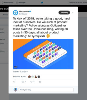
I also inadvertently caused offense to some folks in the company by including a question in the first blog post that posited “Do we suck at product marketing?”.

While I’d intended it as a question (to start the post with a provocative buzz-generating bang), it came across more as a statement, and pretty offensive one at that. Especially when the social team latched onto the power of that statement (rightly so) and started tweeting about it.

I think it was co-founder Carter Gilchrist who helped me understand the impact by asking me “If you’d said ‘Do we suck at design? Or do we suck at engineering?’ how do you think the team would feel about it?” Pretty shitty I imagine. I removed that line from the post. The talented people on our product and product marketing teams deserve better than that.

The 30-Posts-in-30-Days Challenge

The best part of this challenge was getting back to writing. Because I’ve been on the road so much as a public speaker recently, it turns out I hadn’t written a single word on our blog (or Unbounce marketing content in general) for two years.

30 posts was an audacious goal. Especially when you consider how much of it was designed to be an exploration of an approach to marketing that was completely new to me. The posts ranged from 700 to 7,000 words in length and included many interactive demos of our new products baked right into the blog posts – including many hacks that required custom code.

Fortunately, I had the help of some incredible Unbounce developers:

  • Sam Shen – who, with Sabrina Chan’s mockups, built a redesign of the blog (just for the new product marketing category) in two days.
  • Noah Matsell & Brian Burns – who saved my ass by providing many custom workarounds, use case examples, and interactive demos. The most impressive of them being a way to communicate across domains to set and read cookies so that I could demo the cookie targeting feature of the new products.
  • Luis Francisco – one of our designers who is rapidly becoming one of the best hackers of Unbounce. Including the mind-blowing augmented reality demo in my 5 Legitimately Cool Use Cases for Website Popups post.

Not to mention the guidance, brainstorming, reality checks, and content planning help of the awesome Jen Pepper, and five designers who took turns creating the majority of the blog post hero images under the guidance of Cesar Martinez.

The craziness of the challenge was important to me. I don’t get inspired by normalcy. I love chaos and ridiculous ideas, and honestly, if I’d planned on writing three blog posts I probably wouldn’t have written any.

Turns out I was a bit too ambitious, and after ten consecutive sixteen hour days (weekends included) I decided to remove weekend posts from the schedule because they get little traction anyway, and focus more on quality than quantity, resulting in this post being number 20 – still pretty damn good.

Pretty sure my wife Nicole would’ve left me if I continued at that pace with the neglect that came with it. #alwaysbeoptimizing


Content Marketing Performance: Was I Wasting My Time?

Given that I was now dealing with pure product awareness, the topic of content marketing in general became top of mind. In particular, how does our blog perform as an agent of customer acquisition?

Digging into Kissmetrics I was shocked by what I uncovered.

As an attributable part of customer acquisition, the content I’d written on the blog in January was converting readers to NTS (new trial starts) at the paltry rate of 0.3%. Let me repeat that. Zero point three percent.

The blog converts at 0.3%. WTF?! How can that be the case?

What am I (and/or we) doing so wrong that this number is a possible reality? Content has been the hallmark of our marketing since we started Unbounce 8 years ago.

Time to dig deeper into the data.

The Data Insights & Lessons Learned I’ll be Sharing in This Post

In the interests of transparency (one of our six core values), I’ll be sharing all of the data I could find that helps shed light on the performance and effect of my month of madness.

It’s important to note that the full impact of this endeavor won’t be visible for a few months for a couple of reasons: we measure a customer as someone who’s paid us three times, and true product adoption can occur at any time.

Here’s a linked list of the data, insights, and learnings that you’ll find in the remainder of the post.

  1. The number of NTS (new trial starts) attributed to Product Awareness Month
  2. Historical NTS attributed to the blog
  3. How other companies content marketing performs. I reached out to:
    1. Andy Crestodina from Orbit Media
    2. Cyrus Shepard formerly at Moz
    3. John Bonini from Databox
  4. Impact of the blog redesign
    1. Sidebar
    2. Header
    3. Blog posts with old design
    4. Individual blog post interaction
  5. Blog traffic
  6. Blog Subscription Conversion Rates for different popup trigger types
  7. The impact of changes to our highest organic traffic page
  8. SaaS app login data
  9. Product awareness and adoption numbers
    1. Visitors
    2. Users
    3. Customers
  10. How many words I wrote
  11. Impact on writing quality
  12. What I should be writing about next

I’ll also discuss what I learned as a marketer, writer, and SaaS co-founder, after living the past 30 days like this.

Insight #1 – Blog Conversion Rates to NTS attributed to Product Awareness Month

Here’s a look at the funnel report in Kissmetrics that shows the conversion rate from visits to the new content to new Unbounce trial starts (NTS).

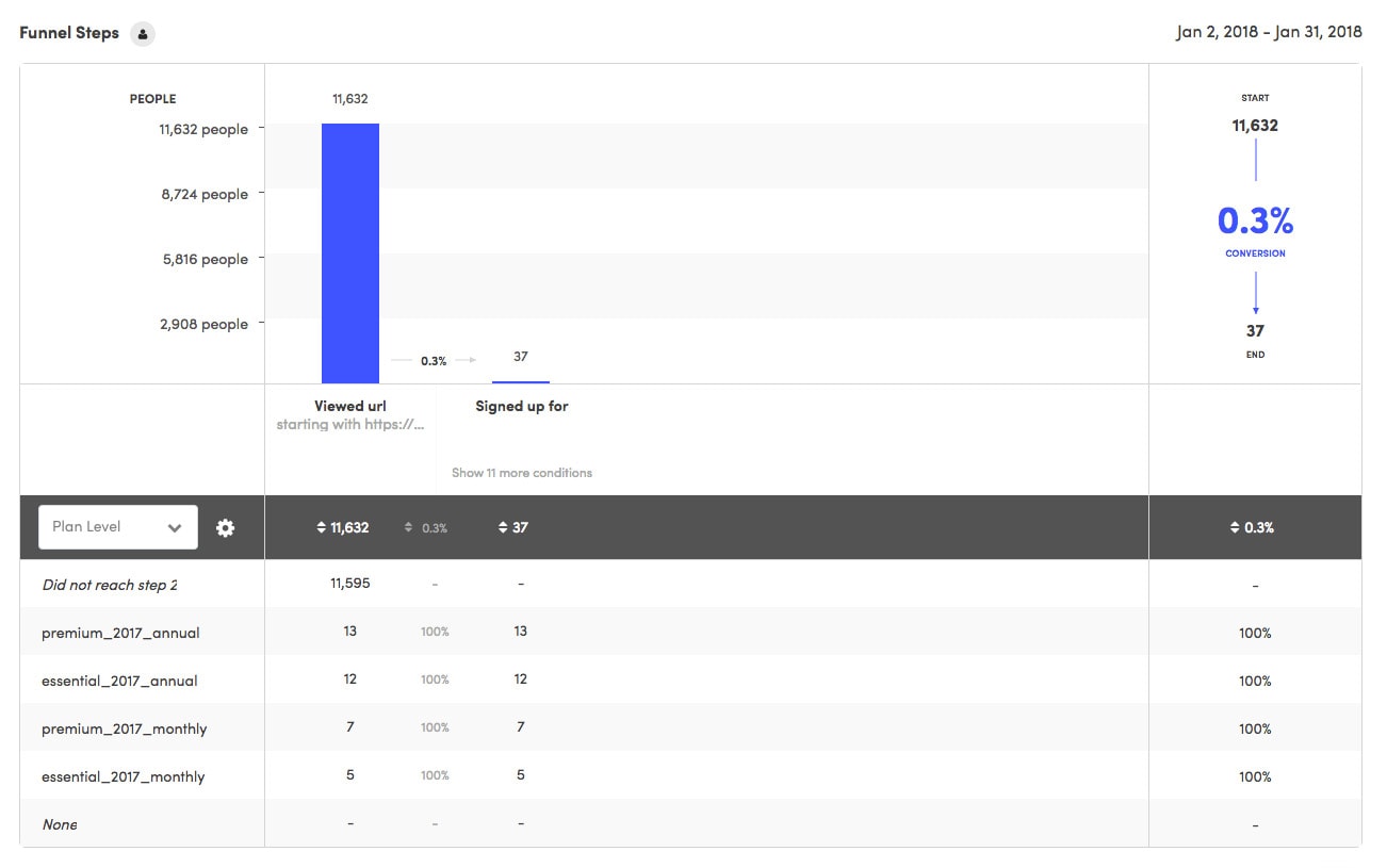
As I mentioned, I was really shocked by this number. Only 37 NTS from all that effort? I was starting to think that my content simply wasn’t interesting or relevant enough to convince people to sign up.

Was it just me?

Insight #2 – Historical Blog Conversion Rates

Then I looked at some historical data to make a comparison. The chart below is for the previous 9 months of blog content. I would’ve looked further back in time, but since we switched the website to HTTPS the reporting gets a little more complex.

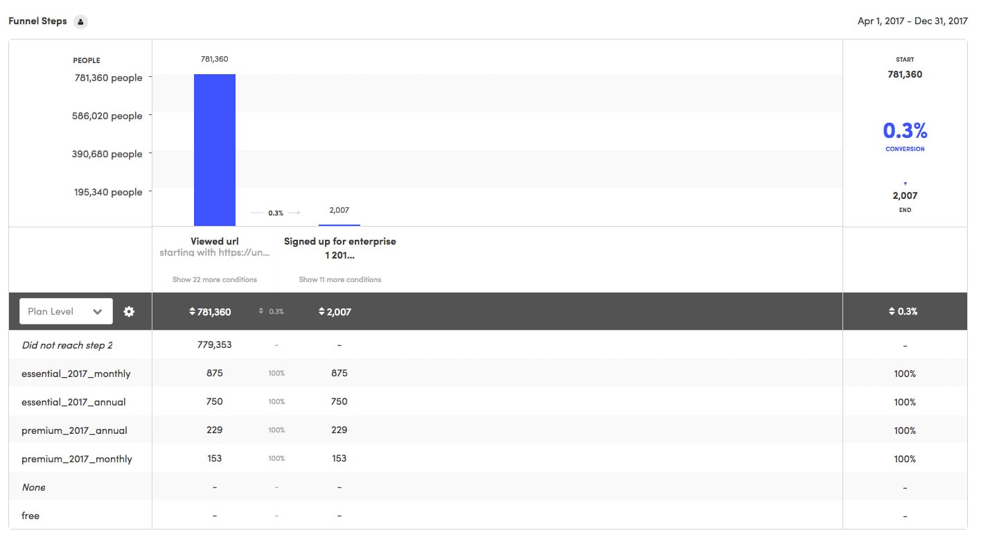
Turns out that our blog converts at that rate in general. It’s important to note that the second chart is based on every single blog post on the blog, for that 9 month period, which is why the actual number of signups is so much higher.

At least it’s not just me.

Now, you may be inclined to think that given the low numbers, the blog doesn’t have the efficacy to warrant its existence or at least the amount of effort that goes into maintaining it. I know I started having some doubts.

But then I reached out to some industry folks who I deeply admire for their content marketing prowess, to see what their experiences and thoughts were on the topic.

Insight #3 – Content Marketing at Other Companies

The first person I contacted was Andy Crestodina, co-founder of Orbit Media a Chicago web development a design agency. Andy is a good friend, an incredible speaker, and a genius content marketer whose expertise I value highly. Here’s what he had to say:

This is an awesome question that gets to something that a lot of content marketers may not understand: it’s the indirect benefits of content marketing that drive results. And in a lot of cases, it’s about SEO. The content drives the links, which drive the authority, which drive the rankings, which drive qualified visitors who searched for a “commercial intent” keyphrase …and now you have a visitor who is highly likely to convert, unlike your typical blog reader.

Here’s the data on our analytics. We had just over a million visits last year. (yay!) And 91% of those visitors started on a blog post.

But do these people ever really turn into business leads?

…not really. Almost never actually. But obviously, we’d have a lot less traffic (brand awareness) if we didn’t publish anything. Our site would be just a brochure. We wouldn’t have followers or subscribers. But the other downside of not having a blog (and maybe the most important benefit of blogging) is the links.

According to Open Site Explorer’s “Top Pages” report, there are virtually no links to our service pages. The top 217 linked-to pages, except for the home page, are blog posts and authors.

So without these pages, we’d have no authority …and no ranking for the “money phrases”.

If you want to attract visitors who have strong intent, who have their wallets out, you have to have a lot of content, links and authority so you can rank for the phrase. I bet the Unbounce analytics and rankings look a lot like this.

If you want the fortune, you’ve got to get the glory first!

Genius.


I also reached out to Cyrus Shepard, the former Director of SEO & Audience Development at Moz. Here’s what he had to say:

Our content with the highest conversion rates were always surprising and very specific (posts about title tags and how to run a site audit). The problem was, while these pieces had a 5x conversion rate over other content, the number of overall conversions they drove was actually small compared to our total. In other words, if we would have focused on these micro-problems exclusively, our overall sales would likely have been much smaller.

Counter-intuitively, we found we did better on big content with corresponding ridiculously low conversion rates, because it raised awareness. Awareness raised brand interest/queries, and 2-3-4 months down the line we close the sale when they are ready to purchase. In other words, our content with the actual highest conversion rates—as it is with all companies—was our homepage and “about” pages (and also our tools, but that’s another story). So raising brand awareness long-term always trumped short-term content-specific conversions.

Some similar sentiment to Andy where the long-term thinking, and believe that if you publish exceptional content you will benefit in indirect ways.


Finally, I reached out to John Bonini from Databox, who explained how they use dashboards (created with their own product which looks awesome) to keep a close eye on blog attribution. Here’s the one John shared with me. I embedded it in an iFrame so I’d suggest clicking inside it to scroll inside the different data blocks.

https://app.databox.com/datawall/c5f03a185fa8dc79307a07150b06083d05a735d72

And here’s what he had to say about how their blog benefits their business:

1. For us, the blog plays a pretty powerful role in getting readers into the product. We transitioned to freemium last year, so the barrier to entry into the product is low. What works well for us is covering the challenges that marketers and salespeople are having in tracking performance and making sense of their data. Rather than rely on premium content like ebooks and webinars (we use these more for customer marketing) we’ll include free templates for dashboards that help solve the problem we’re writing about. It’s a fairly straight line from problem>>solution, which is why the blog is such a powerful lever.

2. Content attribution is hard. And the reality is that monthly reporting decks are binary–were the goals hit or not? Are we growing at or above the rate we need to…or not? Gross revenue was X. ARR is Y. So when you start talking about the importance of multi-touch attribution in order to measure the effectiveness of the blog, you run the risk of seeming like you’re “in the clouds.” I’ve had heated debates with executives who felt strongly against “being a publishing house.” Because attribution in many cases wasn’t a straight line, the content to them was fluff, and the time spent on it was sunk cost. The best thing to arm yourself within those cases is specific examples. Measuring the aggregate success of your blog is hard, but when you’re tracking the success of specific blog posts you know see a lot of traffic, you can better illustrate the value in producing more and optimizing for the long-term. That’s why I use the attached chart to keep an eye on our top visited pages (most of which are blog posts) and track the number of signups coming from each. As organic traffic grows, so does the output from each post. If you can convey that quickly and succinctly, you make a strong case.

Who’s Reading Your Blog?

We need to also recognize the fact that sometimes the person reading your content isn’t the person who ends up paying for it. There’s a difference between a functional user and a functional buyer, and that’s why attribution is the single biggest challenge in marketing today.

Connecting the who with the what with the when and the why is very difficult, for almost everyone.

Takeaway – It’s all yo’ blogs too!

We need to think a little differently when choosing the metrics we assign to our content marketing. I’d love to hear about how your blog performs in regard to similar metrics. Jump in the comments if you’d care to share.

It’s worth discussing a few other factors when thinking about the value of a blog. I know that personally, when I’m looking at the website of a software or service provider, if they don’t have a team page with photos of the company’s employees, a physical address for the office, and a blog that’s active, I won’t give them my business – unless they are the only option.

In many ways perception is reality.

If you don’t appear to be active or don’t appear to be a thought leader in the space you’re selling in, you simply don’t appear as credible as a company who is.

So Is Content Marketing a Waste of Time & Money or Not?

No. Clearly not. You just need to understand the nuances of how you measure your ROI so that you’re not thrown off by the metrics and numbers I’ve just shared with you.

In the rest of this post, I hope you will learn enough to persuade you if you’re not persuaded about the value of content marketing, and if you already are, I hope you learn some brilliant tactical ideas for 2018.

Insight #4 – Impact of the blog redesign

In this section, I’ll cover the impacts a new blog design (just for this month’s posts) impacted interaction behavior. I’ll break it down into three sections:

  1. Sidebar: How did a new product focused sidebar perform?
  2. Header: We introduced a new header navigation bar with a different focus.
  3. Old posts: A comparative look at how the header and sidebar interaction was on posts with the old design.
  4. Individual posts: How did interactions with the header CTAs vary between different post topics?

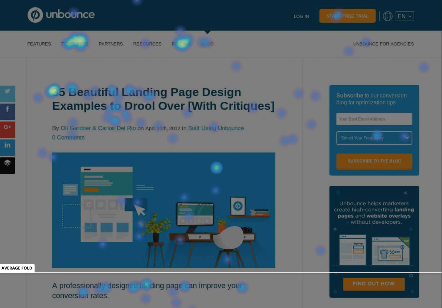
Insight #4a – Impact of the blog redesign: analyzing the new sidebar

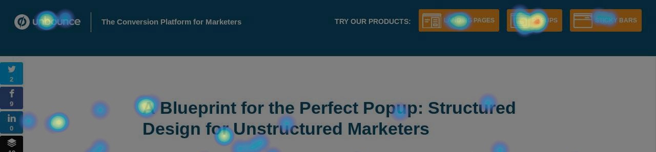
Part of the redesign included a new sidebar dedicated to the two new products. You can see the before and after designs below.

Blog Design Before and After

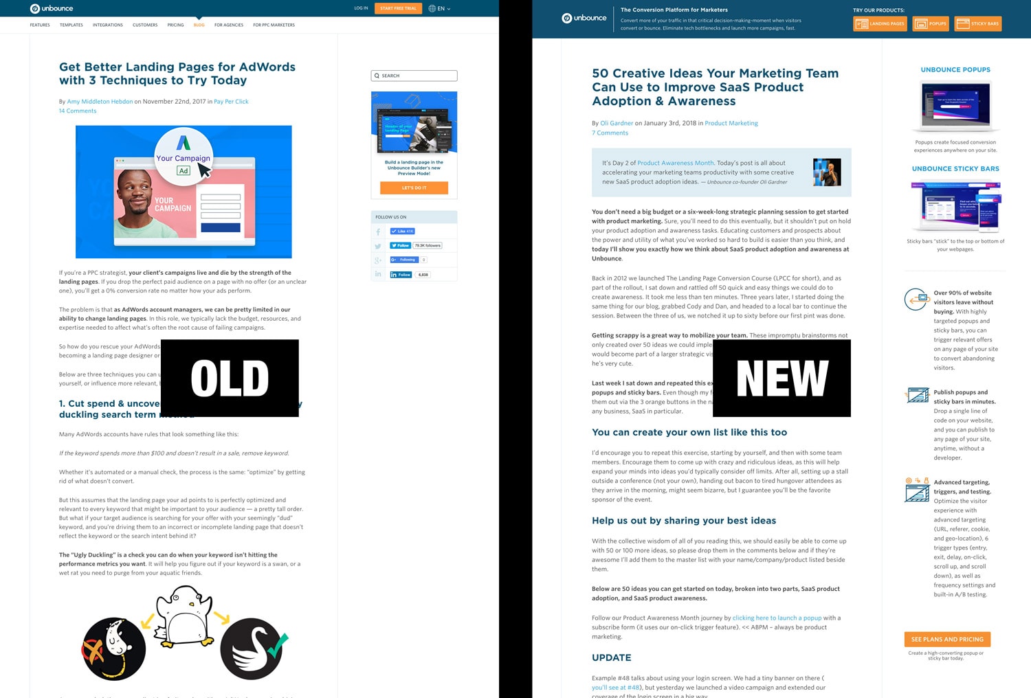
I was pretty excited to see how this would perform as we’ve never been that blatantly promotional on the blog before.

Here’s a click heat map based on traffic to the first few posts. The screenshot background is auto-generated from the first post, but the sidebar and header were constant elements that show cumulative clicks.

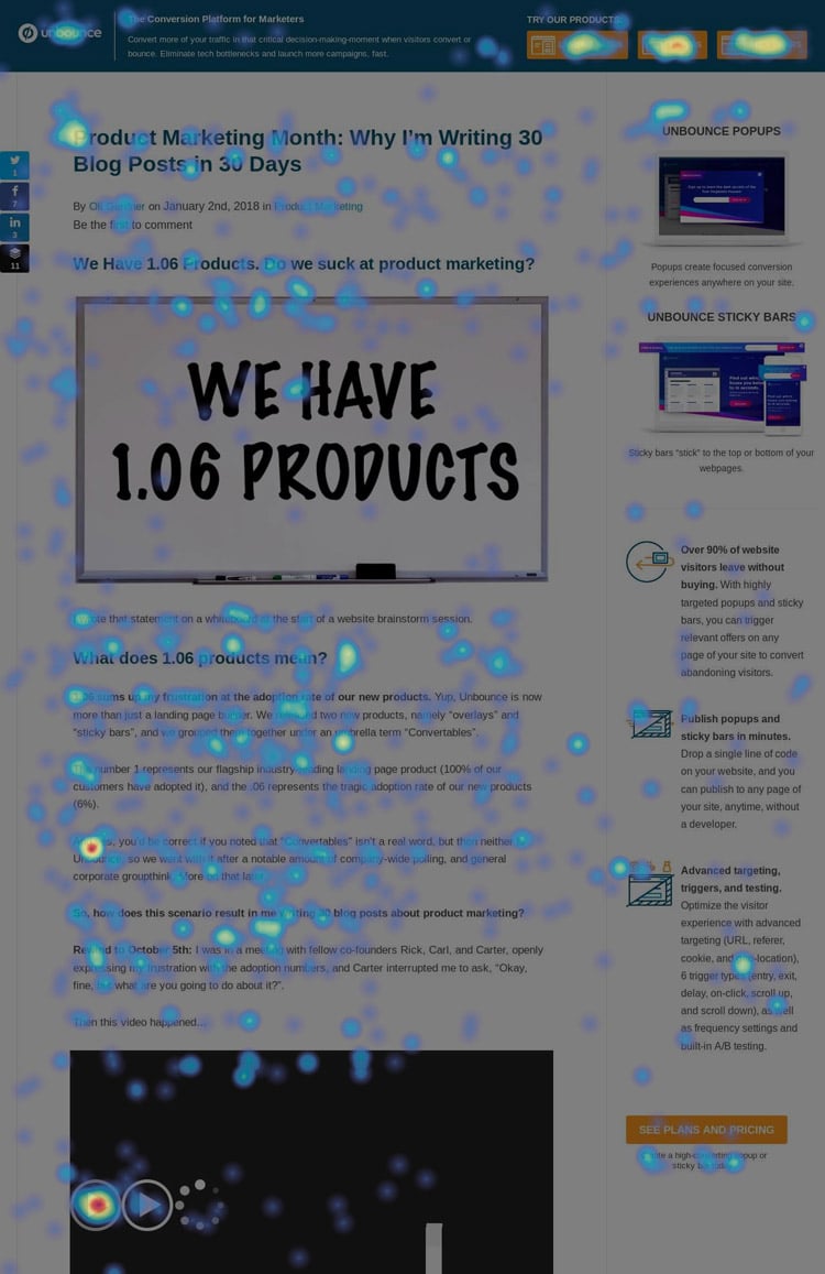
Out of 1,481 (desktop) visitors and 3,428 clicks, only 3 people (0.09%) clicked the sidebar CTA. More people clicked on the statement beneath the button than on the button itself.

My first instinct was to think that the subtext read as a clearer and more actionable statement than the button copy, so I reversed them (putting the subtext as the button copy), but it changed nothing.

Nobody cared about the sidebar CTA.

Something to note is that it wasn’t a sticky sidebar (it disappears as you scroll) which no doubt had an impact on the low engagement numbers, but the content was too long to make it a persistent sidebar because the CTA wouldn’t be visible in most browsers.

Takeaway – Nobody cares about your sidebar

After a week with little to no interaction with the sidebar, we decided to simply remove it. I think the reading experience is significantly nicer without it.

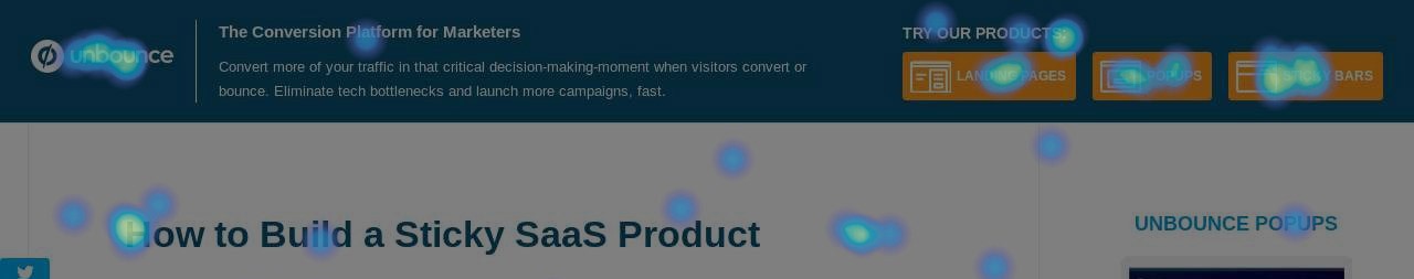
Insight #4b – Impact of the blog redesign: analyzing the new header

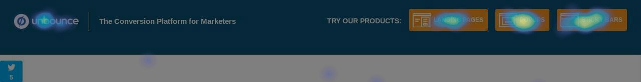
The more significant change to the blog was the new header. Removing the standard SaaS navigation with features, templates, integrations, pricing etc. allowed the content to be the focus, with a greatly simplified expression of our product’s value proposition.

Here’s a wireframe for the new header.

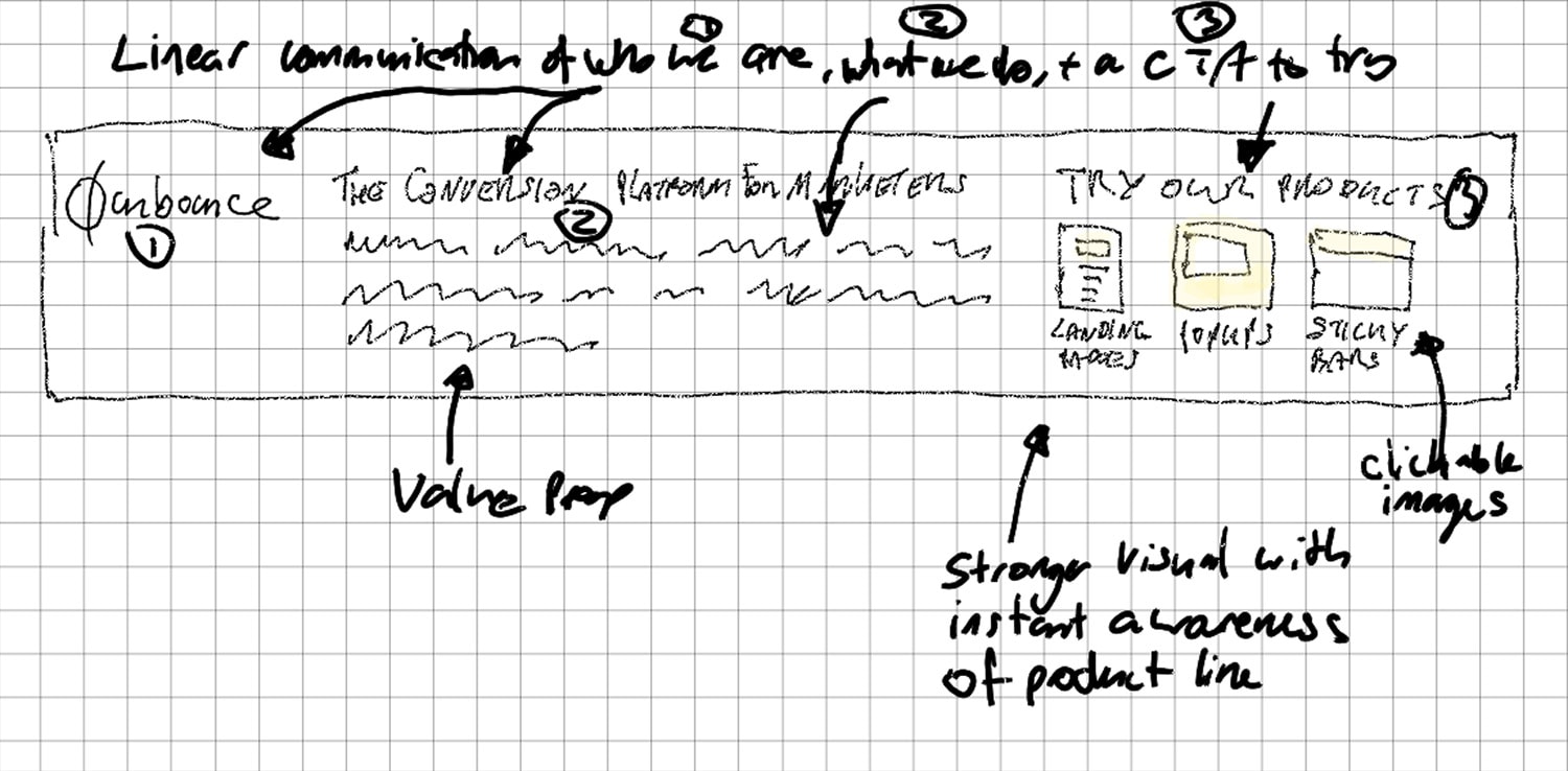
I loved nerding out with my new reMarkable tablet to sketch many of the diagrams and illustrations throughout the month. Apologies for my terrible handwriting, but if you’re a visual thinker and communicator it’s the best product I’ve ever used.

Let’s take a look at some heat maps for the header.

Week One

The heat map below is for the first four blog posts and shows quite a lot of activity on the three product CTAs.

Number of clicks
[Landing Pages: 26] [Popups: 39] [Sticky Bars: 43]

Total clicks on product CTAs
108 out of 1,481 clicks = 3.15%

Week Two

The next one is for the middle part of the month after the sidebar had been removed.

Number of clicks
[Landing Pages: 106] [Popups: 124] [Sticky Bars: 99]

Total clicks on product CTAs
329 out of 7,596 clicks = 4.42%

Week 3

Week 3 is missing because I’m an idiot and forgot to start the heat map recording in Hotjar.

Week 4

Later in the month, the heat map tells a slightly different story. Note that this is a smaller sample size as it’s not been collecting data as long.

Number of clicks
[Landing Pages: 16] [Popups: 28] [Sticky Bars: 33]

Total clicks on product CTAs
77 out of 2,387 clicks = 2.56%

The lower % of clicks here might be explained by repeat visitors not having a need to click again. Or it could be the topic and quality of the posts, or it could be a sampling issue.

Insight #4c – Click Map Data From Old Posts

To gain some comparative perspective, I dug out some heat maps from blog posts that have the original design, to see how they fared. It’s not an apples-to-apples comparison as the CTAs are not the same in both designs.

But it is interesting to note that on this blog post about 35 landing page design examples (our highest traffic blog post of all time), the combined number of clicks on the top CTA and the sidebar CTA was 2 out of 1,844.

And a similarly high-traffic landing page examples post only received 6 clicks out of 1,777 visitors.

It seems you have to work really hard to get people to click your product CTAs from a blog post.

Insight #4d – Interaction Based on Blog Post Topic

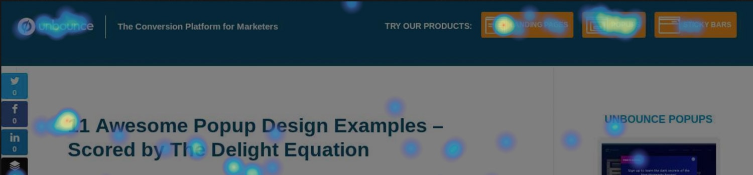
If we look at individual posts from Product Awareness Month, we can see some really interesting patterns based on the topic of the post. For the five posts below, all of them have a dominant percentage of clicks going to the product being discussed in the post.

In the examples below the values represent the number of clicks each CTA received.

Popup Post 1: A Blueprint for the Perfect Popup


[Landing Pages: 4] [Popups: 13] [Sticky Bars: 2]

Popup Post 2: “Maybe Later” – A New Interaction Model for E-commerce Entrance Popups


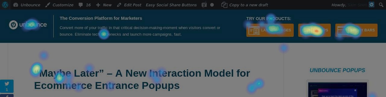
[Landing Pages: 9] [Popups: 20] [Sticky Bars: 12]

Popup Post 3: 11 Awesome Popup Design Examples – Scored by the Delight Equation


[Landing Pages: 11] [Popups: 16] [Sticky Bars: 2]

Sticky Bar Post 1: 9 Creative Sticky Bar Examples – Plus 21 New Unbounce Templates

Super low traffic on this one, but the pattern remains intact.

[Landing Pages: 1] [Popups: 3] [Sticky Bars: 9]

Sticky Bar Post 2: How to Build a Sticky SaaS Product

This one’s not really even about sticky bars per se. It just has the word in the title and an equal measure of mentions of the sticky bar and popup products.

[Landing Pages: 4] [Popups: 5] [Sticky Bars: 9]

Takeaway – Context Matters

Now it might seem obvious that it would be the case that the blog post topic would dictate product interest, but it’s still really nice to confirm it through data and to know that the content is indeed driving the intended behavior from the audience.

Insight #5 – Blog Traffic

One of the things we’ve been learning of late is the importance of getting back to basics with SEO, and writing content that people are actually searching for. Obvious enough. But that’s not what I had in mind when I started this month of content production. I was stuck in my own head, with my own concepts, and my own ideas of how I was going to change things.

As a result, about half of the content I wrote has an easily identifiable search term to optimize for. But the other half don’t.

I’m okay with that, to an extent, because I firmly believe you can’t spend all of your time answering people’s search questions. That’s a critical path to business success, but in order to rise above your competitors, you also need to invent things. To come up with new ways of thinking – actual thought leadership.

I have an innate need to create things that not only scratch an itch in myself, to expand my intellect, and thought process, but also because I want to inspire someone else to care or grow, or experiment, and think in ways they hadn’t previously considered.

It’s similar to the concept of breaking content marketing into two buckets of lead gen and awareness. You need inspiration as well as resolution.

I digress. What’s the traffic to the blog been like this month? Well for starters, when I made this crazy challenge to myself, I didn’t realize that our blog traffic has taken a big hit in the past year. I’m not sure what my decision-making process would have been had I known. Do I get more excited because I want to re-energize the blog? Or do I think that it’s not worth the effort if we don’t get much traffic anymore?

Here’s a GA chart of traffic to our blog since we started Unbounce in 2009.

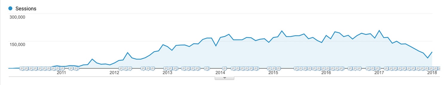
You can see that in early 2017, things changed, pretty dramatically.

(You can also see that we’ve got a decent boost this month).

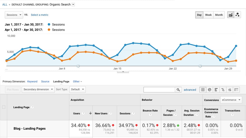
If we segment this by organic traffic and compare April 2017 to January 2017, you see a graph like this, where we lost around 35% of our organic blog traffic in one quarter.

I reached out to Cody Campbell, our Marketing Manager of Funnel Growth (and resident SEO pro) for an explanation. Here’s how he described what had happened:

We have 1250 posts published on the Unbounce blog.

In 2017, those posts drove 1.6 million sessions to our blog. That’s 18% of total website traffic.

Of that 1.6M sessions, 77% was Organic. Yay for SEO…but this was also an incredibly terrifying fact at the same time. We had all our eggs in one basket. And lucky for us, that basket was performing really well. Until it all came crashing down.

The Largest Traffic Drop of 2017
In the 4 month period between January and April, blog traffic dropped 74,000 sessions.

Here’s the breakdown:
Organic: 60k decrease
Direct: 7.3k decrease
Social: 2.2k decrease
Email: 5.3k decrease

After digging deeper, we found that the majority of the traffic drop came from 23 posts. Wait. What? 1.84% of our posts were driving the bulk of our blog traffic? Yup.

…Holy sh!t. What happened?

Most of those high traffic blog posts were written between 2012 to 2016 and we hadn’t touched them since. Meanwhile, numerous competitors entered the market and content marketing hit its climax.

The spreadsheet below shows some of the posts, and the impact this period had on them.

The result?
We’re now competing against a ton of other companies in the Google SERPs all of whom are trying to rank for the same keywords.

Our competitor’s content was far more up-to-date than ours (and in some cases even better), so, naturally, it started to get more attention from readers. Google took notice and started dropping us from position #1 to position 2 or 3.

Moving from position #1 to #3 lost us up to 50% or more of our traffic per post. And when that happens and you only have a handful of posts holding up your blog, you’re in trouble.

Takeaway

In a highly competitive space, it’s critical that you maintain your organic rankings by updating and optimizing your important blog content so it doesn’t fall below the quality and impact of what others are doing.

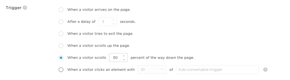
Insight #6 – Blog Subscription Conversion Rates for Different Popup Trigger Types

In order to explore the concept of two-step opt-in forms, I set up two methods for people to subscribe to the weekly email digests we created for those interested in following along with Product Awareness Month.

Version 1 used an exit-triggered popup to present the subscribe form, and version 2 used a click-triggered popup to create the two-step opt-in experience.

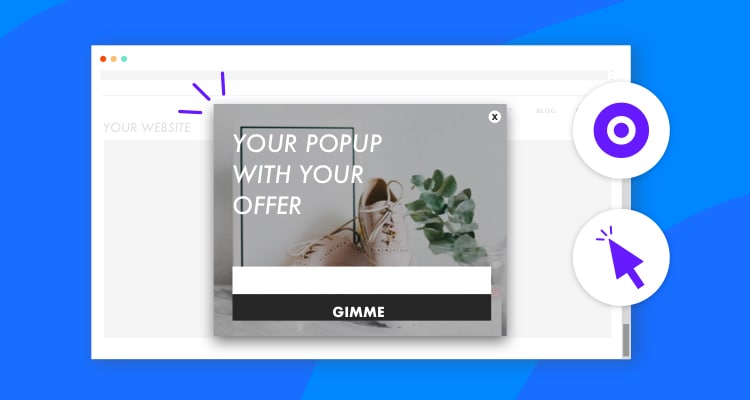
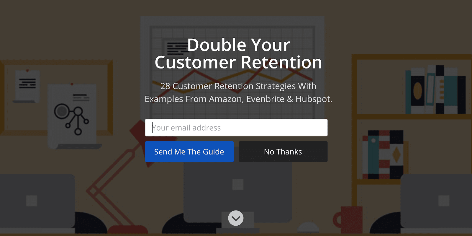
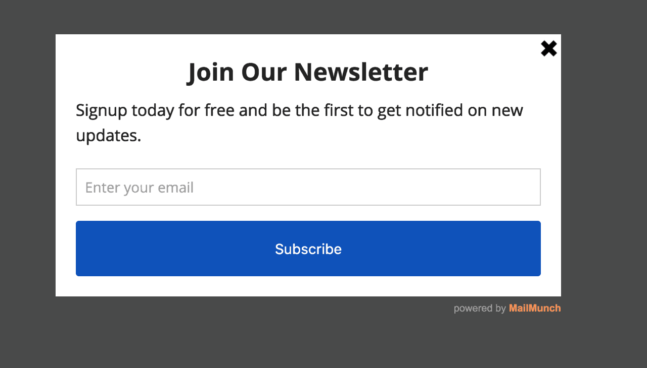
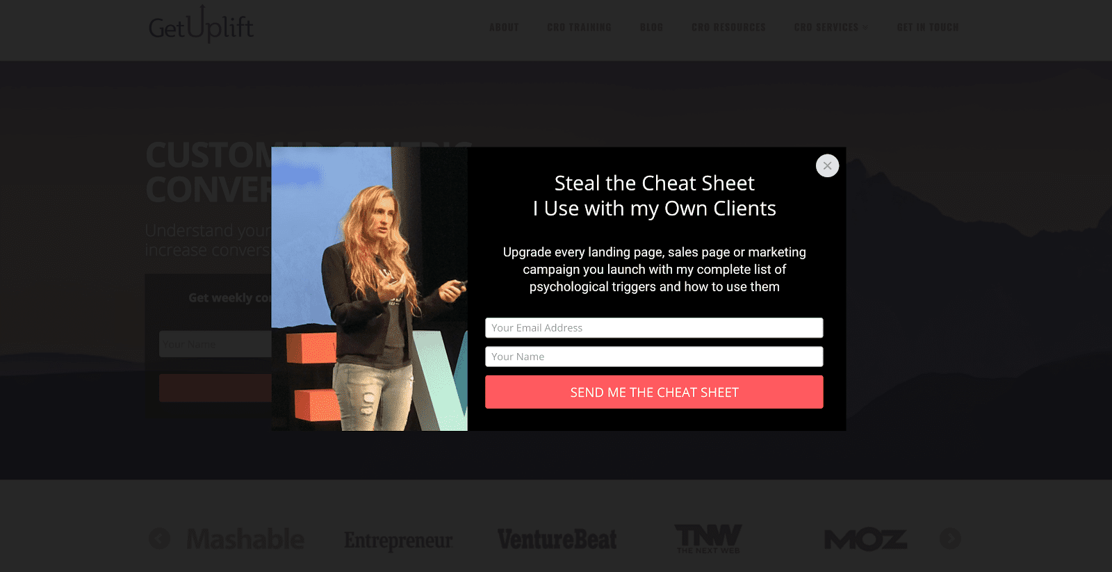
Here’s the popup people were shown:

Trigger Method #1 – Exit Popup Subscribe

Exit popups are great in that almost everyone sees them, but they don’t have the intelligence to know whether the visitor was enjoying the content or not. In our experiences, the conversion rate depends highly on the perceived value of the offer.

When we give away video recordings of events we put on (webinars or conferences) the conversion rates are fantastic, between 15 and 30%.

When you’re offering a blog subscription, it’s typically in the 1-5% range. In this instance, we were offering a subscription to the blog, but the value was described as following along with our product awareness experiment, as opposed to the blog in general. Limiting the value even further.

The conversion rate for the exit popup hovered around the 2% range, dipping to 1.86% overall.

Trigger Method #2 – Click Popup Subscribe

The click trigger is the absolute best option if you want to create a valuable experience, as the popup you show is based on an explicitly expressed intent. I set up links throughout the blog posts, asking people to subscribe. When they clicked the link they got the popup.

The conversion rate for the click-triggered popup varied from around the 20% range, dipping to 15.57% overall.

So for this example, the click-triggered popup outperformed the exit popup by 722%.

Declining Conversion Rates

The reason I mention the dips in conversion rates is that I found the change really interesting. The sample sizes are not very big (120 and 52 conversions respectively), but the conversion rates held fairly steady for weeks, dropping closer to the end of the month.

This could be entirely based on sample size, but another hypothesis I had was that the motivation to subscribe was waning with every day because the value was diminished as the month went on. If you’re being asked to subscribe to a one-month content experience, and there are only 1 or 2 weeks remaining, it makes perfect sense that fewer people would care.

I can’t prove or disprove either explanation, but it’s definitely food for thought when designing time-based experiences like this.

Takeaway

It’s important to consider whether the value of your offer changes over time – either increasing or decreasing – so that you can better understand the subsequent motivation.

Insight #7 – Call to Action Clicks on Our Highest Traffic Content Page

As part of my post about the highest-traffic page you’re neglecting, I rewrote the content on our “What is a Landing Page?” page that receives over 10,000 unique visitors per month.

As part of the exercise, I experimented with three options in a choose-your-own-adventure format, as a learning exercise so we can study what these visitors are actually looking for.

Option 1: “I’m new to landing pages, and want to learn more.”
CTA >> [ Watch The Landing Page Sessions Video Series ]

Option 2: “I have a landing page, but I’m not sure how good it is.”
CTA >> [ Grade Your Page With The Landing Page Analyzer ]

Option 3: “I need to build a landing page.”
CTA >> [ Try The Unbounce Builder in Preview Mode ]

When I looked at the scroll map data it showed that fewer than 50% of visitors were scrolling far enough to see the three CTAs.

So I moved them up to the top of the post, right beneath the opening description of what a landing page is – based on the fact that 86% of visitors scroll that far, and that the needs of most visitors have been met at this point (answering their question about what a landing page is).

Then I recorded the clicks that the three CTAs were getting to measure the intent and experience level of the audience. The values in the heat map below show the percentage of all clicks on the page.

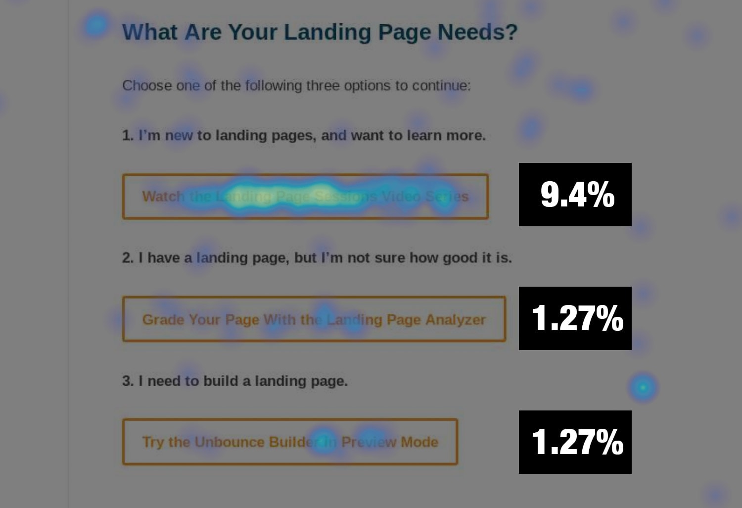
Out of 983 desktop pageviews, the numerical distribution of 141 clicks was as follows:

[I’m New: 111] [I Have an LP: 15] [I need to build an LP: 15]

It’s really clear that the beginner level CTA is most relevant to visitors to this page. Makes total sense. But when we were looking at this, Cody wondered if the order of the CTAs might be an influencing factor.

So I flipped the order and ran it for another 1,000 pageviews.

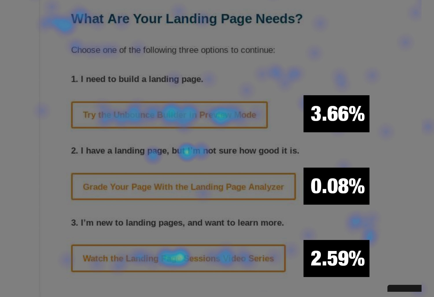
This time, out of 1,013 desktop pageviews, the numerical distribution of only 83 clicks was as follows:

[I need to build an LP: 48] [I Have an LP: 1] [I’m New: 34]

Really interesting that the number one slot retained its position as the click leader, but the overall number of clicks dropped from 11.94% to 6.33%, a decrease of 89%.

I’d like to run this again as an A/B test with a larger sample size, but my hypothesis for why the number of interactions dropped is that the first option is too aggressive for the majority of visitors to this page, resulting in them not going to the effort of reading all three options.

To add a little confirmation to the experiment, I reverted to the original order and ran the heat map again.

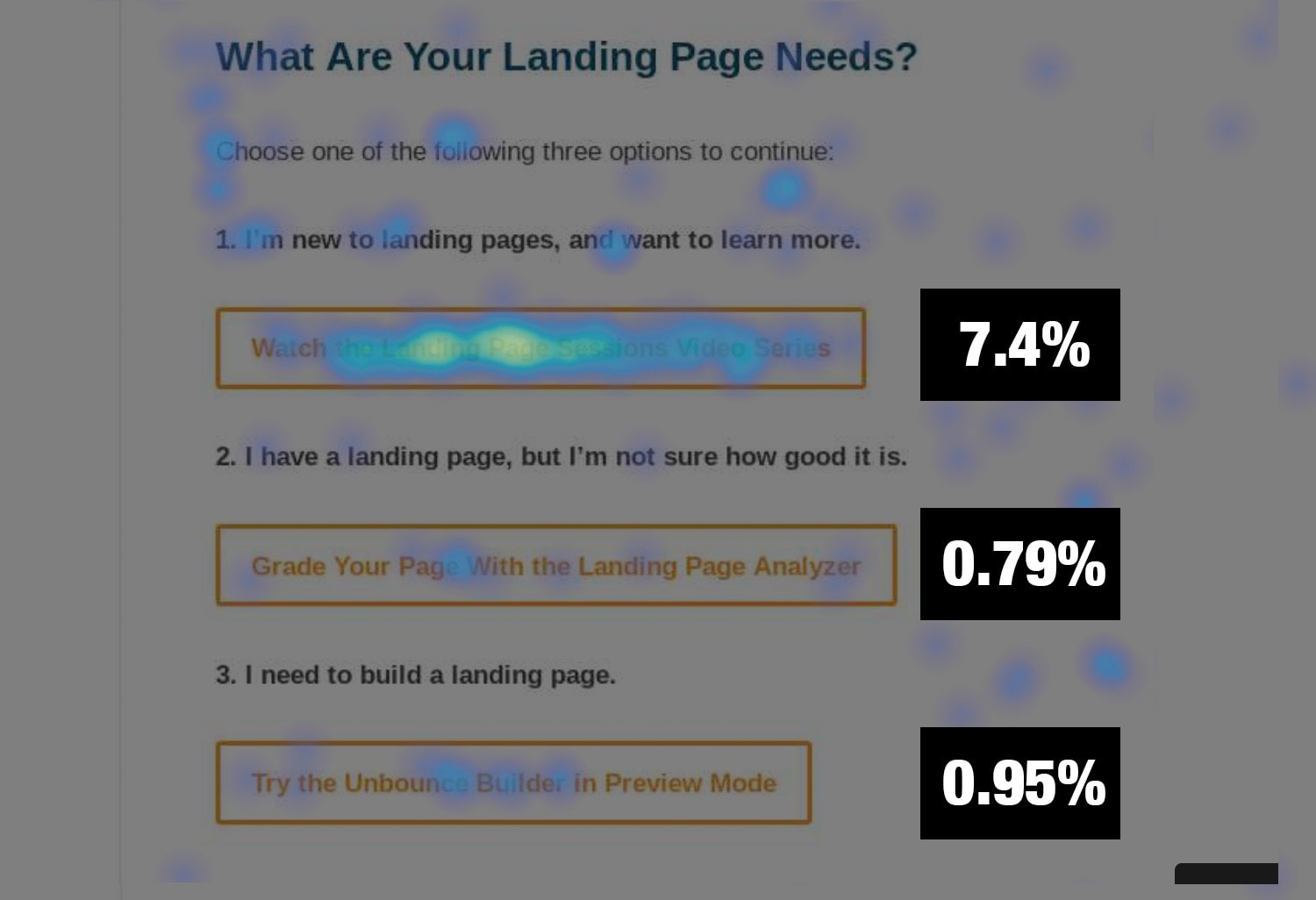
This time, out of 835 desktop pageviews, the numerical distribution of 116 clicks was as follows:

[I’m New: 94] [I Have an LP: 10] [I need to build an LP: 12]

Which is very close to the first one in terms of distribution.

Takeaway

Choose-your-own-adventure navigation is a really fun and interesting way to learn about the intent of your visitors, and the order and magnitude of the action you’re asking people to take can influence how much interaction takes place.

Fascinating stuff!

Insight #8 – SaaS User Login Visits

This one is a bit tangential, and came to me when designing The Login Hijack concept in my post about cool use cases for popups.

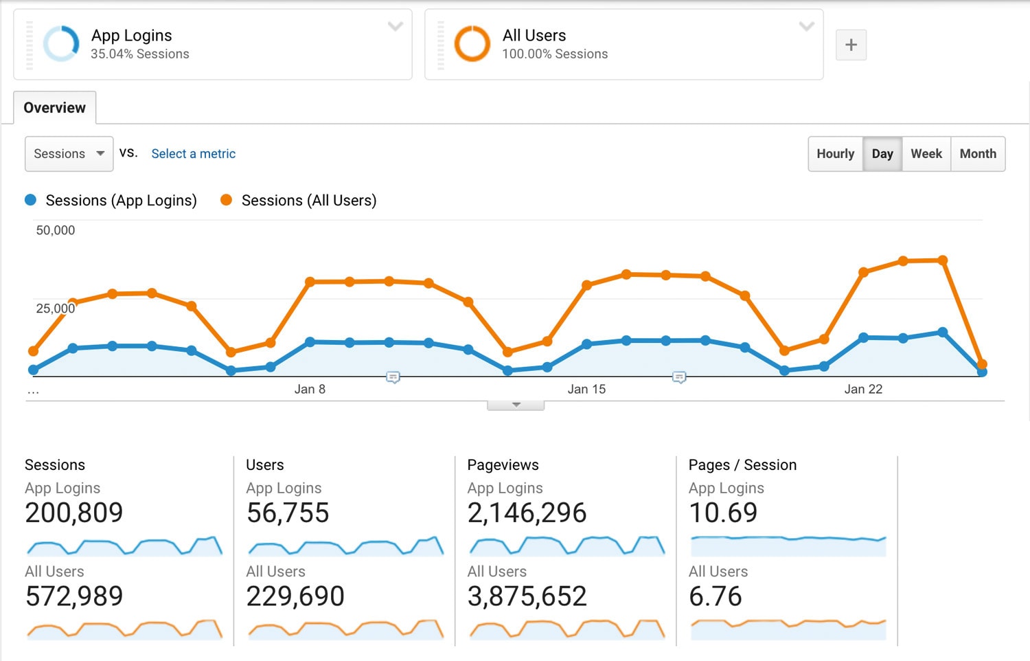
For SaaS businesses, it’s very common for people to visit your website for the sole purpose of logging in to your app, and if you don’t take this into account your metrics can be way off.

You can see that for Unbounce 35.04% of website sessions are used to log in to the Unbounce app.

I reached out on Twitter to inquire about the numbers at other SaaS companies and found a lot of similarities:

  • Stefan Debois‏ reported that for SurveyAnyPlace.com it’s 45% of homepage visits
  • John Bonini from Databox shared that their number is 28%
  • Jon Davis from Shape.io reported a number of 30%

All of these numbers represent significant potential for incorrect reporting, and opportunistic product marketing to your customers who are showing up for this reason.

Takeaway

I ran a Twitter poll to extend the question:

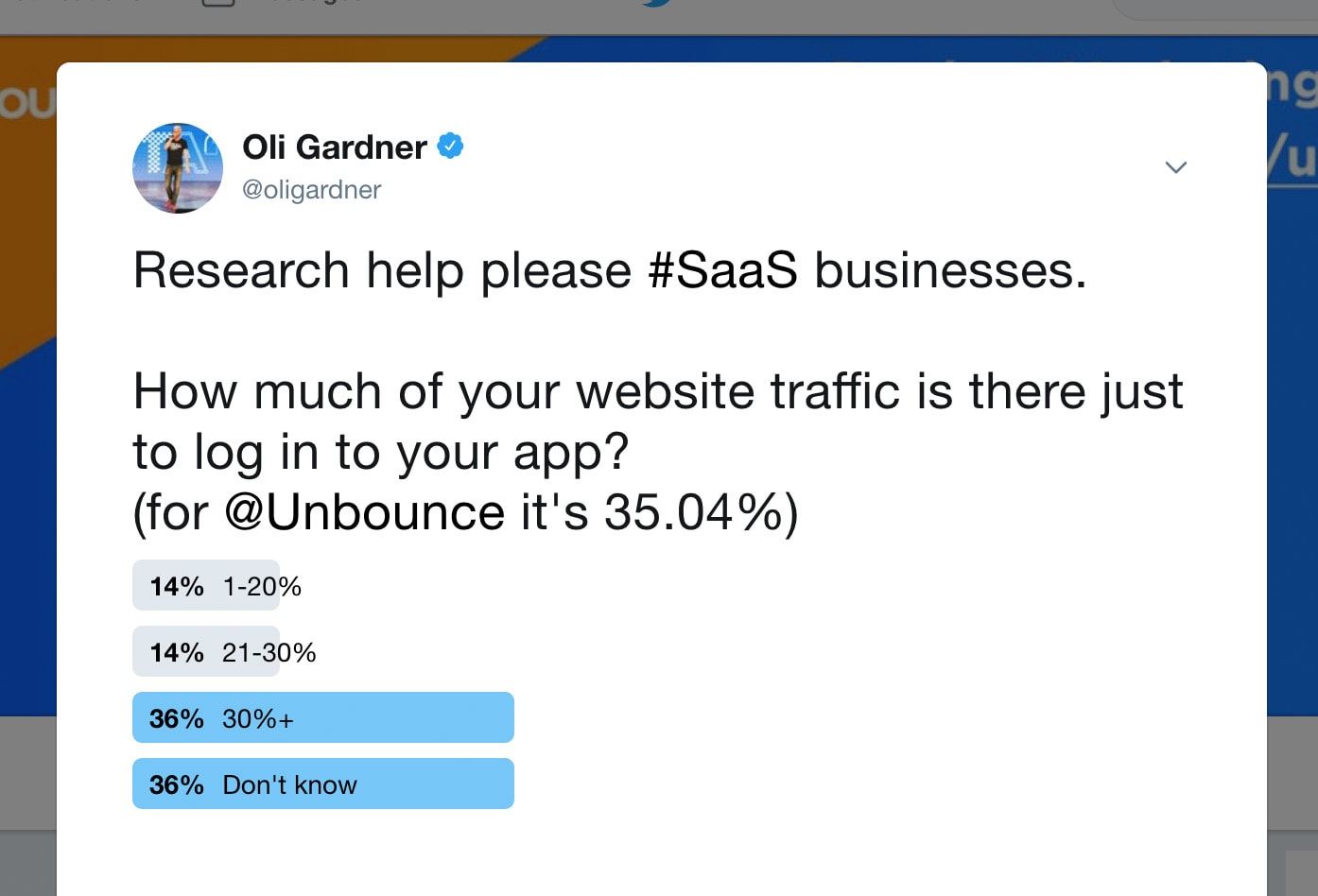
What’s particularly interesting is that the majority of people who answered don’t know. We all need to know this number. Go find yours and report in the comments.

Insight #9 – Product Awareness and Adoption Data

In this section I’ll cover the levels of awareness increase based on three segments of people:

  1. Visitors: new folks coming to Unbounce.com who have never used the product
  2. Users: those with an Unbounce account of some type who have not paid us three times
  3. Customers: those who have paid us three times

Insight #9a – Product Awareness: New Visitors

Looking in GA, there were 8,036 new visitors who were exposed to the new Product Awareness Month content – who were not current users or customers.

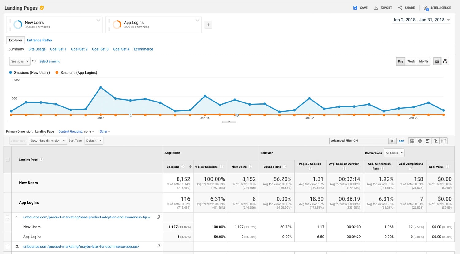
This will be an interesting chart to follow over time to see which content continues to produce organic traffic.

Looking at Kissmetrics we can look at the cohort who have reached a product touchpoint including documentation, features pages or campaign landing pages specific to popups and sticky bars (but not the new PAM content):

Visitors have seen awareness content (excl. PAM)

Visitors have seen awareness content (with PAM)
These are visitors who have found their way to the product touchpoints AND also saw the PAM content.

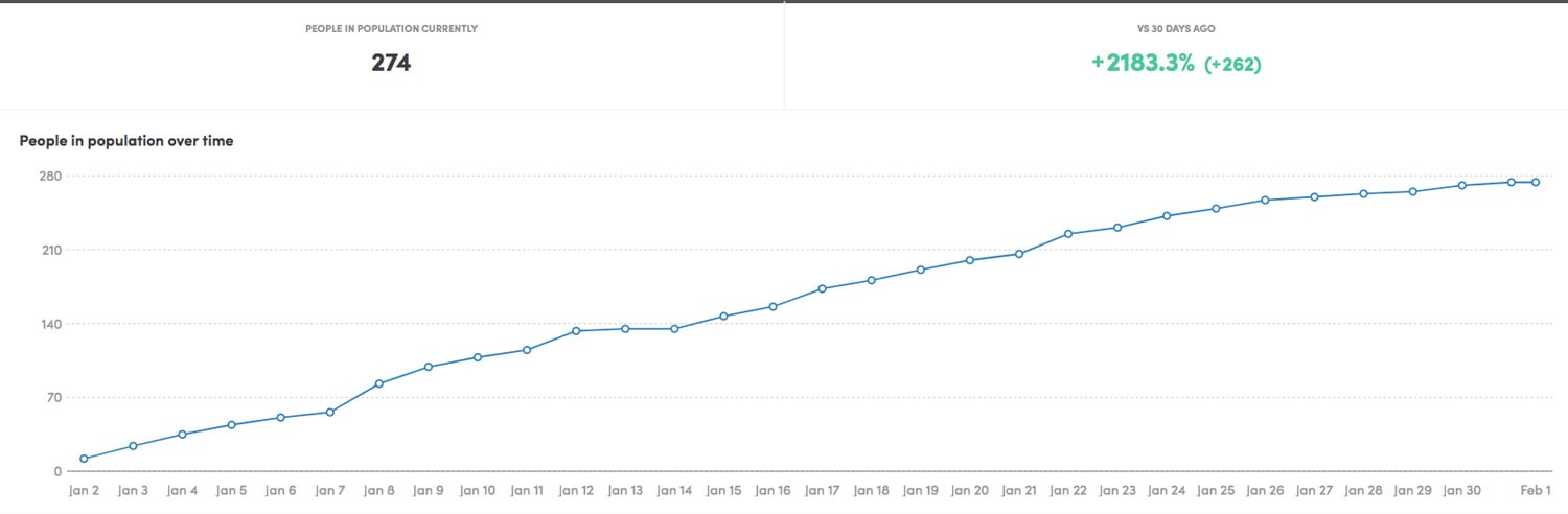
What this shows us is that 274/3762 = 7.3% of total new aware visitors in January came from the Product Awareness Month content.

Insight #9b – Product Awareness: Users

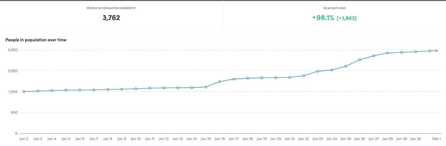
Let’s use a different lens for a moment. The previous section was an analysis of Unbounce customers based on our definition of a customer being someone who has paid us three times.

But what if we look at overall users?
Our user count is much larger than the customer count because it includes those still on their free trial as well as plans like free / student / startup / not-for-profit.

In the past 30 days, changes in product awareness look like the chart below. That’s an increase of 2,031 people (10.7%) in the total population based on the activities and campaigns of the awareness squad.

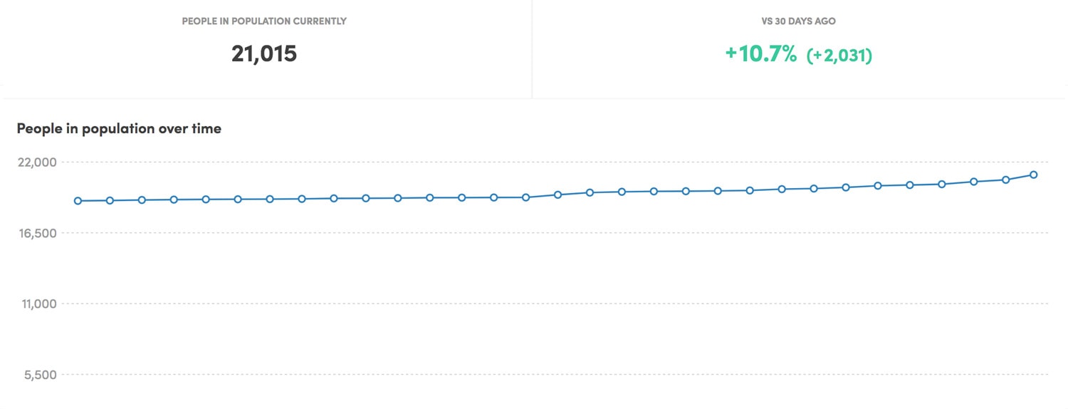
Now if we include folks who’ve seen the Product Awareness Month content, the number rises by an additional 374 people.

In essence, what this tells us is that the Product Awareness Month content contributed 18.4% of the total user awareness increase in January.

That’s pretty damn cool. And because it’s content, it will continue to live on and continue to increase awareness. At least the portions that speak to search intent, and those that inspire backlinks.

Insight #9c – Product Awareness & Adoption: Customers

When we first began marketing popups and sticky bars we were focused on both prospects and customers. But adoption is largely dependent on customer awareness of the products, and so one of our teams in Customer Success got to work.

Knowing awareness was the goal, they launched a campaign designed to make sure our customer base knew we weren’t just a landing page builder anymore.

They created an epic video, embedded it on this landing page, and ran their campaign, which included redesigning our login screen to take advantage of a placement every customer sees multiple times:

The results? The team’s had 3,473 visits to the landing page (about 27% of our active customer base) and 52,603 views of the new login page ad above.

For the purposes of this campaign, the team defined “aware” as anyone who had reached a product touchpoint including documentation, features pages or campaign landing pages specific to popups and sticky bars.

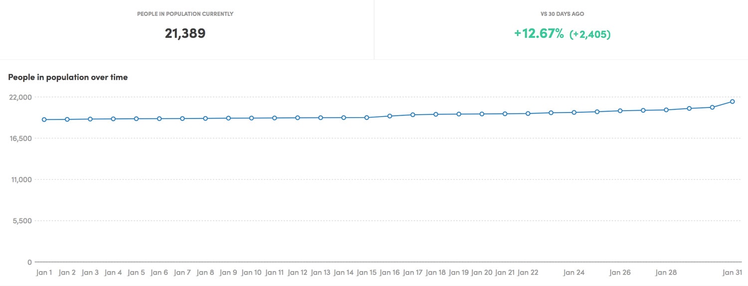
The data below represents awareness changes over time as defined above. It currently doesn’t filter for customers only, but does include criteria that someone has accessed the builder in addition to the other touch points aforementioned:

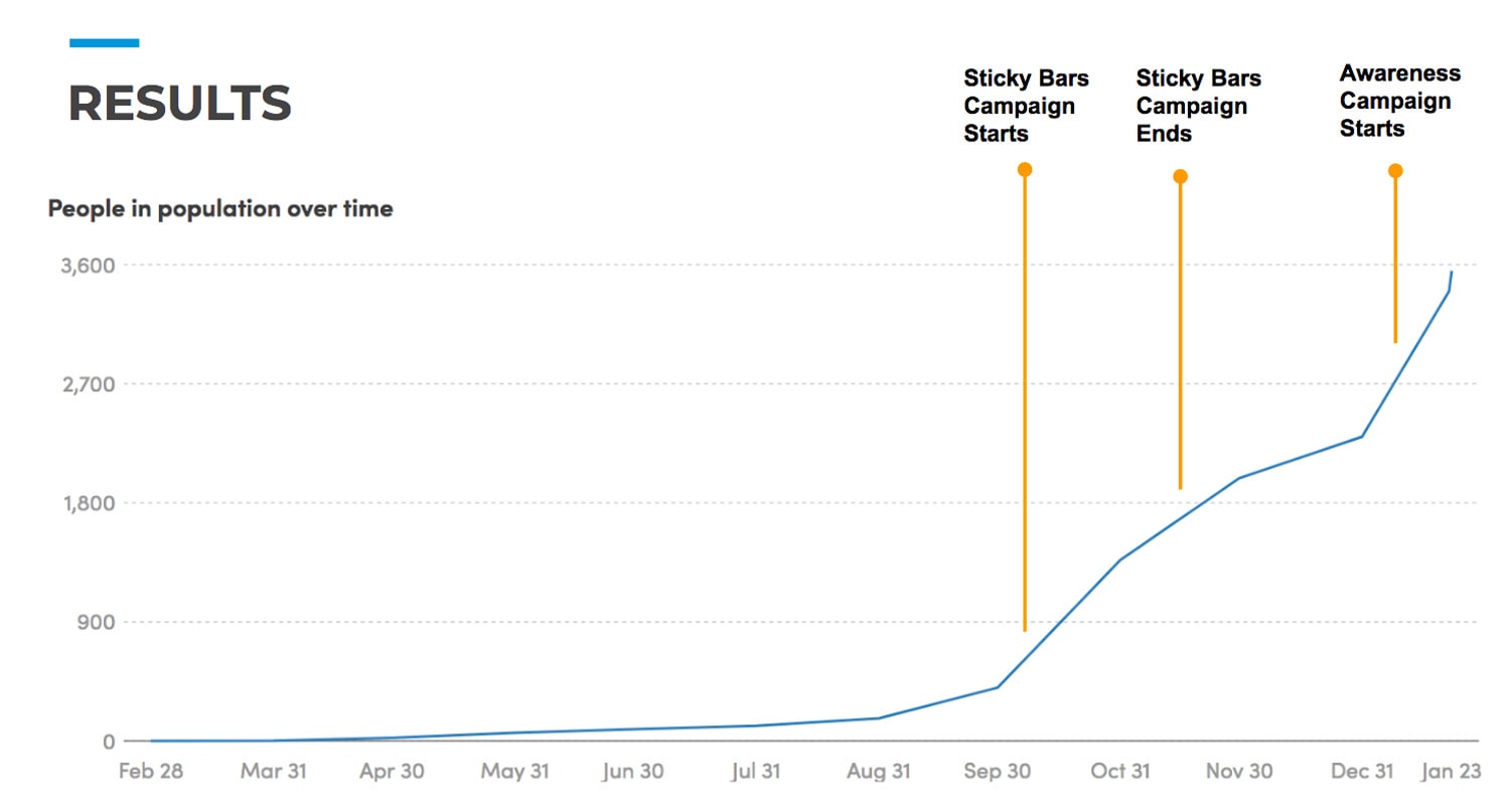
As you can see, corresponding to the launch of two major customer campaigns, there has been a steading increase in encounters with these touchpoints, and thereby awareness.

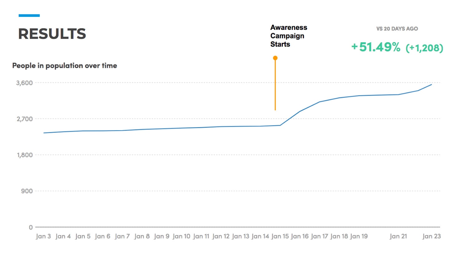
There has been a 51.49% increase in awareness in just the first week following the launch, as seen in the day-by-day view below:

Regarding adoption, our product adoption funnel looks like this in simple terms:

Created -> Published -> Installed -> Evaluated -> Adopted

The chart below shows the growth of the various stages since we launched the limited beta at the end of 2016.

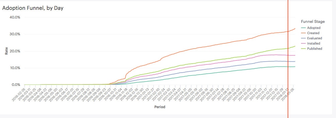
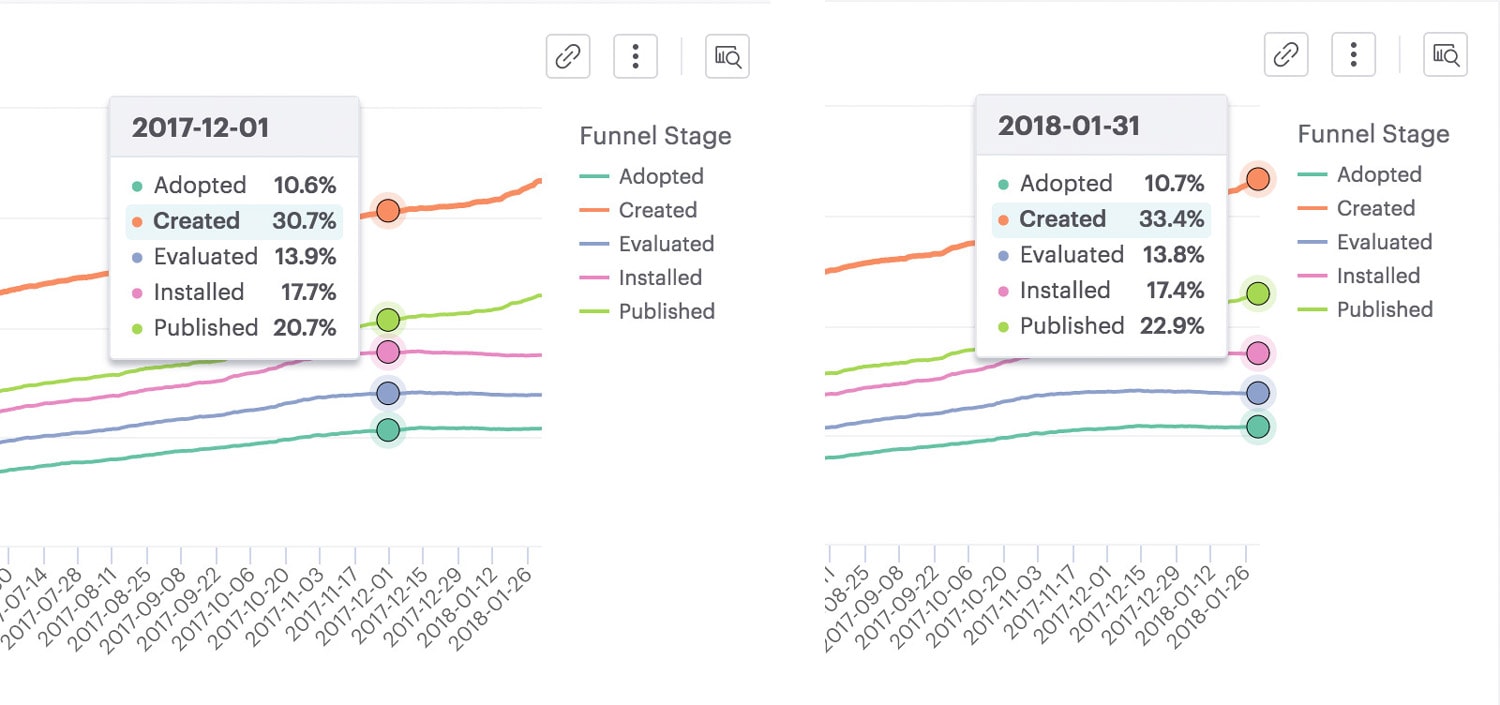
Zooming in below, you can see that some of the adoption funnel metrics are a bit flat, but the exciting thing is that the number of popups and sticky bars being created and published is showing a great improvement which will naturally lead to adoption. And it looks like the lift started right around the time of the January 15th campaign launch.

We have a phase 2 campaign going out soon focus on driving people all the way through the adoption funnel, which will hopefully amplify these early successes.

Takeaway

While the blog could work to increase awareness with those who’ve never heard about us, customer campaigns are still very necessary.

Insight #10 – How Many Words Did I Write?

Including this post my tally sits at around 37,000 words.

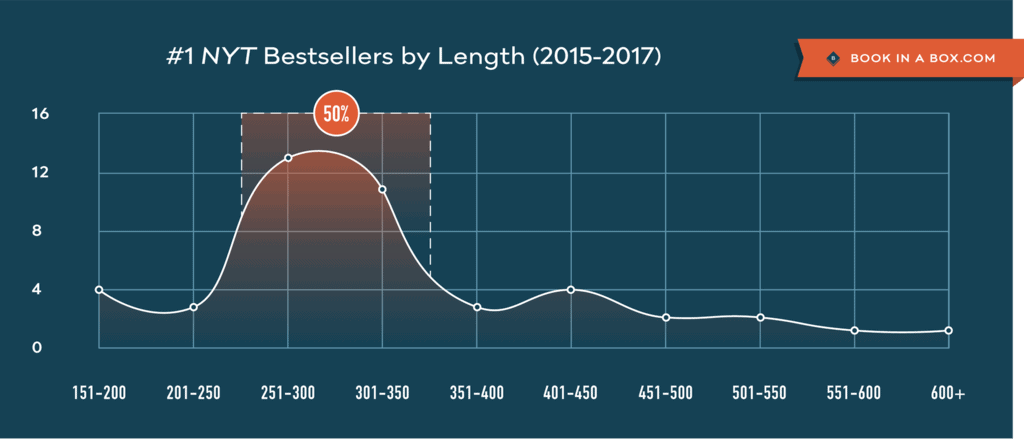
According to research into the page count of recent NYT bestsellers list books, 300 pages is about the right length. At an average of 250 words per page, that totals 75,000 words.

Basically, I’m halfway to having people read about popups and sticky bars on a plane, in my book they bought in an airport bookstore.

Takeaway

Write 20 more posts then stick ‘em all together and call Wiley and Random House.

Insight #11 – The Impact Quantity Has on Quality

I put out some seriously awesome content this month. Stuff I’m really proud of in terms of creative thought and interaction design. But there’s one thing that’s missing (I think) from the writing, once I started to get tired from all the writing.

I lost my edge in terms of personality and humor.

It just wasn’t possible to write that many posts, with that many words, and find a way to make it as entertaining as I expect my content to be. But that’s because there were no second drafts, no editing, virtually no QA on mobile. It was always a 2am battle to finish the day’s post to publish it before I went to bed.

Add. Rinse. Repeat.

Another important factor was that because I was so rushed, and creating so much content, I had no time to do any image optimization. There are no alt or title tags on the images and links, so there’s a big missed opportunity for image search. Having an extra day per post, would have made a big difference.

Takeaway

I love the quantity. I guess I’m vain that way, but if we want our content to live on past the typical 3-5 day window that blog posts have to be seen, then they either have to be so special that everyone links to them, or so on point with the search intent of your ideal customer that it’s find time and time again.

One of the biggest drivers of traffic to our blog from organic search is to a post about email subject lines, which has absolutely nothing to do with our target audience. We used to have a very broad full-stack breadth to our content which was great, it has a ton of value. But it doesn’t attract our ideal customer, which makes it a waste.

Tough lesson learned. We’ll be focusing our content (aside from this month’s insanity) in a much more targeted manner this year, and I’m excited to see how much of an impact it has on our key metrics.

Insight #12 – What Should I be Writing About Next?

I’ve learned a lot in the past 30 days about what is and isn’t important when it comes to impactful content, and I’m re-energized to continue creating value for our now and future customers. But what form will it take?

Based on the highest organic traffic content, there are two places that need an urgent overhaul:

The Landing Page Conversion Course (LPCC)

The Landing Page Conversion Course has always been great at attracting traffic, however, it’s very out of date, and the product videos are now 5 years old and not representative of what Unbounce has become as a product. It was also purposely targeted at top of funnel signups for our old free account. The focus of the new iteration will be much more targeted at NTS and getting much higher value from the content.

The landing page articles section

The landing page articles section is sooooo old. I wrote it in 2010 and only managed to rewrite one page of it this month (as part of insight #7 above). It’ll be great to freshen this up and provide better value for all those visitors looking for help with their landing page learning.

How do I Feel About Product Awareness Month Now?

Honestly, I don’t think I’ve felt so exhausted at any point in my professional career. This was a barn burner of a month. But it’s been such a rich and valuable journey for me, both as a marketer, and a co-founder. Hopefully it’s also been enriching for those who have followed along throughout this crazy experiment.

What’s next? Well before I dive into those two other projects, I need to get my butt to Mexico for a brief honeymoon with my beautiful bride Nicole. My plane leaves at 10:30am.

Adiós amigos! See you in a week.

Cheers,
Oli Gardner